Collaborative Project with
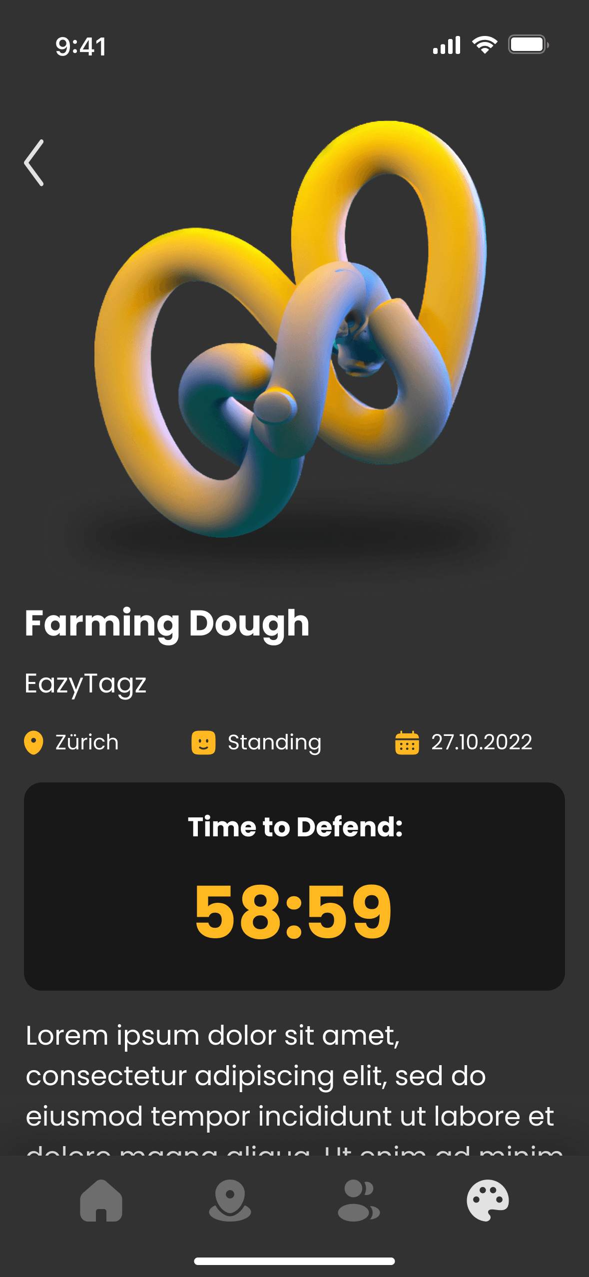
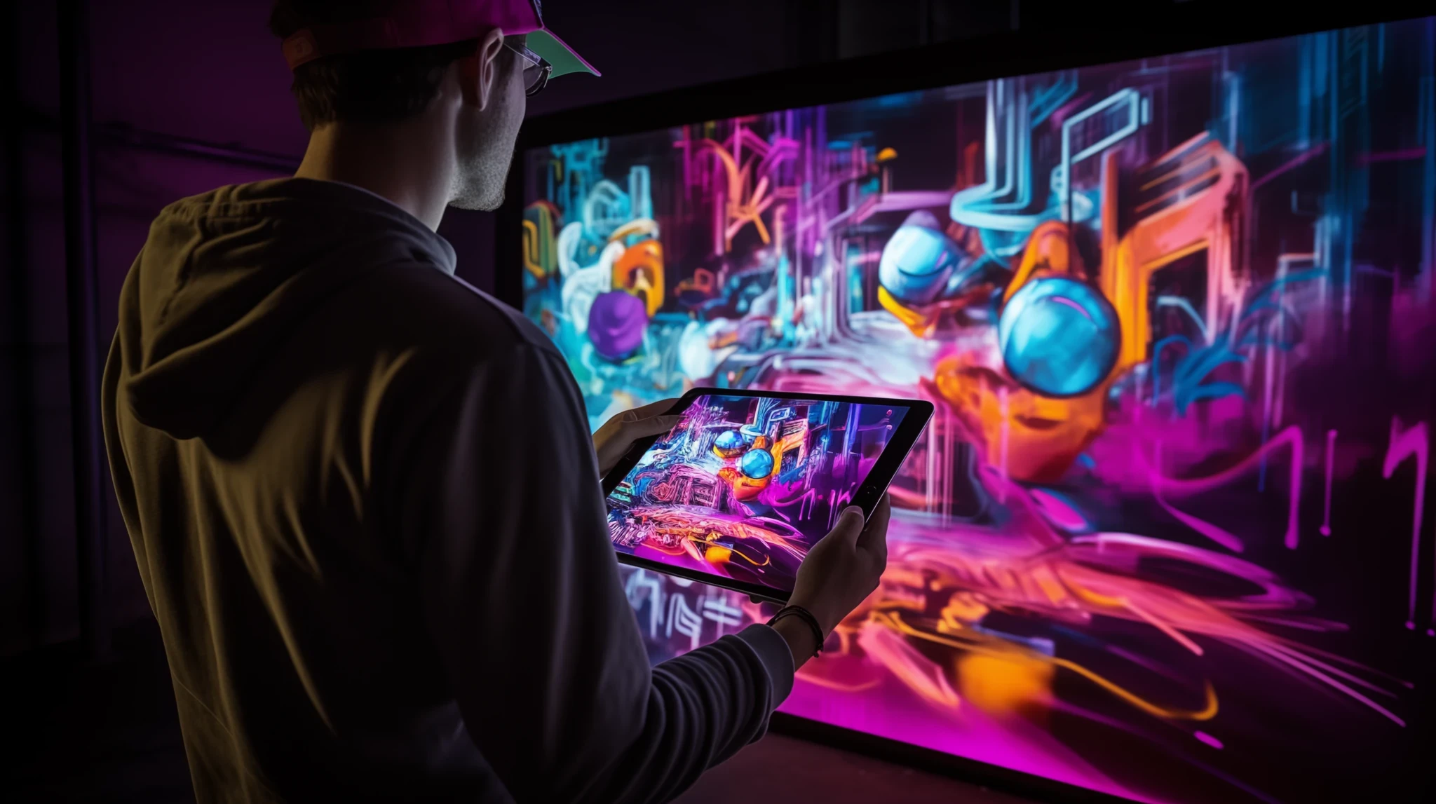
Visible, an AR app for street artists, empowers users to place and create art pieces, compete over territory, and engage in dynamic interactions. The app showcases a gallery for art collection and an AR mode for placing imported pieces and creating new ones using AR glasses. Art pieces can be crossed out by others after 24 hours, triggering a 1-hour defense period
Project Type
UX & UI
AR Smartphone App
AR Hololens 2 App
A Unity Game
Duration
2 weeks
Skills
Visual Identity Design
Design Library
Information Architecture
Usability Testing
User Interface Design
Project Management
Unity Dev. with SDK
Filming, Directing / Editing
Team
Kaitlynn A. Harrison
Miguel Seabra
Robin Good
Collaboration
ZHdK University
ETHZ University
Microsoft Technology
Center in Zürich
My Role
Product Research
Concept Development
UI & UX Design
Ideating Design
Prototyping
Branding Design
Project Management
Worked on the design and development of “Visible” from concept to execution, optimizing user experience for mobile and AR platforms. Collaborated on user research, refined UI/UX, built high-fidelity prototypes, and worked with developers to integrate interactive AR features, balancing creative freedom with intuitive gameplay.
Main Challenge
The main challenge for “Visible” was developing an AR platform that lets street artists express themselves digitally and compete for territory. The app needed to merge digital and physical spaces, with a user-friendly interface for smartphones and AR glasses, balancing creativity, usability, and competitive gameplay.
Users
Our users are street artists and digital creators who thrive on creativity, competition, and community. They seek platforms to showcase art, connect with peers, and explore AR technology. These tech-savvy users value spaces where their art can interact with the real world, claim virtual territories, and leave a lasting digital mark.
Our Solution
“Visible” revolutionizes urban art with AR technology and interactive gameplay, letting users create, place, and defend digital art in real-world settings. The app blends gallery views and immersive AR modes, enhancing engagement with strategic features like a 24-hour defense period.
Research
Our research for “Visible” blended user insights with field studies to develop an AR platform that redefines urban art. We focused on merging digital creativity with real-world spaces, creating an app that resonates with street artists’ competitive spirit.
Market and Competitive Analysis
Identified gaps in current AR and digital art platforms for immersive interaction and social engagement. This insight inspired the creation of “Visible,” merging art, competition, and community by allowing artists to place and defend virtual art in real-world spaces.
Understanding User Needs
Our research included over 25 interviews and surveys with street artists, graffiti enthusiasts, and digital creators, uncovering key user needs and pain points:
• Precise AR Art Placement: Users want tools that allow them to accurately place and showcase their art in real-world settings.
• Competitive Gameplay: There is a strong interest in gamified elements, like defending and claiming virtual territories.
• Community and Engagement: A space where artists can comment, like, and build a community around their creations.
These insights shaped the development of “Visible,” ensuring that the app caters to both novice and experienced users who value creativity, competition, and community.
Key Findings
• Gamification Elements: A desire for game-like experiences that blend creativity and competitive engagement.
• User-Friendly UI: The need for a simple, intuitive interface that facilitates seamless navigation for all users.
• Community Features: A demand for features that promote collaboration, feedback, and community building.
Defining User Profiles
Persona
Developed a detailed user persona that shaped the app’s UI/UX design, ensuring a tailored and engaging user experience.
Miles Jackson
Age
12-year-old
Education
6th Grade
Location
New York
Tech Literate
High
Mention
"I’m all about turning blank walls into something amazing. Whether it’s sketching up some graffiti or exploring new spots with my friends, I’m always creating. Mixing that with tech would be next-level, and the chance to do it together would be unreal."
Personality
Tech-savy, Extrovert, Artist, loves spending time with his friends
Bio
Miles is an artist from New York who’s passionate about graffiti and abstract art. He loves combining his creativity with cool tech, whether he’s exploring the city with friends or working on his next big idea. Always eager to push the limits, Miles is constantly looking for new ways to create something awesome and collaborate with others.
Core Needs
Creative Freedom: Wants to express himself through graffiti and abstract art.
Collaborative Platform: Desires a tech-driven space to create and connect with friends.
Pushing Boundaries: Aims to explore new possibilities in art with a like-minded community.
Frustrations
Limited opportunities to collaborate with others on graffiti projects.
Difficulty finding a platform that combines art and technology seamlessly.
Lack of tools that allow for easy sharing and showcasing of his creations with friends.
Technology Exploration
Researched AR frameworks like Immersal to learn about precise scene detection, cross-platform compatibility, and powerful creation tools, solidifying its position in urban art and AR gameplay.
• Open-Source AR SDKs: Leveraged tools from leading platforms to integrate advanced AR functionalities.
• Scenery Detection and Mapping: Developed technology for accurate virtual art placement in varied environments.
• Cross-Platform Capabilities: Built features that support both smartphone and AR glasses to enhance accessibility and user experience.
Field Research and Direct Feedback
Immersed ourselves in the street art scene by attending events, joining workshops, and testing prototypes with real users. This approach helped us fine-tune features like AR art placement, interactive navigation, and competitive elements to better meet user needs and expectations.
• Prototyping & Testing: Conducted iterative user tests in real-world settings to optimize the AR experience and gameplay mechanics.
• User Feedback Integration: Adjusted design elements based on direct feedback to improve usability and engagement.
Concept Development
Information Architecture
User Flow
Game Mechanics & Reward System
Visual Identity
Focused on creating an immersive AR experience for both smartphones and HoloLens 2. We combined thorough UX research, concept ideation, and prototype testing with design and functionality refinements to deliver a seamless user experience across platforms.
What is Visible?
How it works
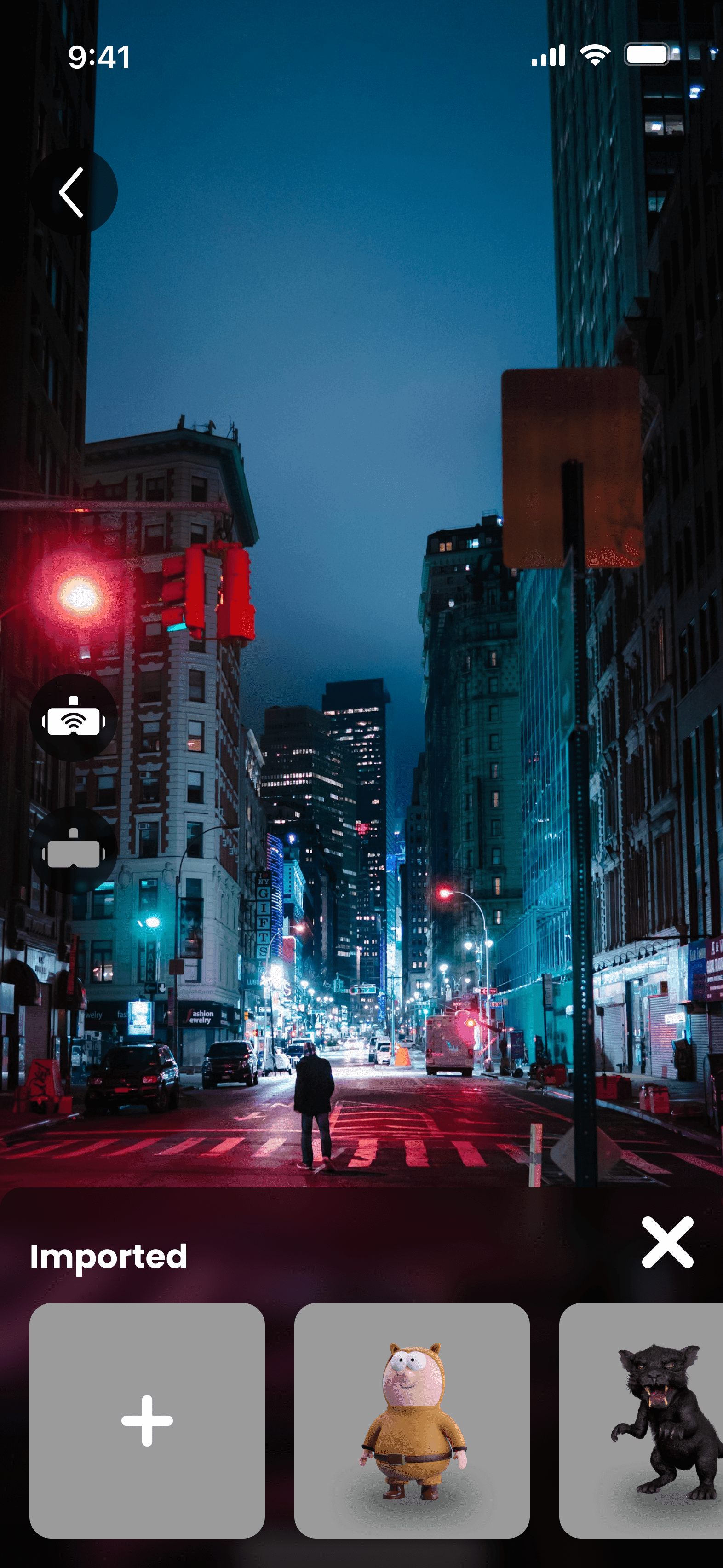
How to Placing Pieces
Crossing & Defending
How Spoting works
Start the Game!
App User Flow Sketch
Information Architecture
The app’s architecture ensures a simple, accessible user flow. Features like digital artwork placement, territory claiming, and community engagement are easy to navigate. A streamlined onboarding process and optimized AR exploration keep the focus on creativity and interaction.
Game Mechanics & Reward System
The core of “Visible” revolves around dynamic gameplay that encourages creativity and competition. Users can place their digital art in real-world locations and defend them from being crossed out by others. The reward system is based on respect points, gained through successful defense of artworks and other creative activities. This gamified approach adds a layer of strategy and excitement, motivating users to explore, create, and compete.
Moodboard
visual identity merges street art, cyberpunk, and digital graffiti. Bold typography, glitch effects, neon accents, and clean, minimalist graphics create a modern, futuristic look that reflects the dynamic energy of urban art.
Branding
Logo
Colour Scheme
The branding for “Visible” blends sharp, angular typography inspired by street art with a sleek, modern look. The color palette mixes bold hues like pink, blue, and orange with neutral tones, creating a striking visual contrast suited for both digital and real-world settings.
Full LOGO
LOGO
LOGO/Icon
Typeface: Helvetica
App Design
System Design
The app design prioritizes user-centric navigation, making it easy to create, place, and defend digital artworks in real-world spaces. It enhances accessibility and creativity for seamless interaction between digital and physical environments.
Wireframes
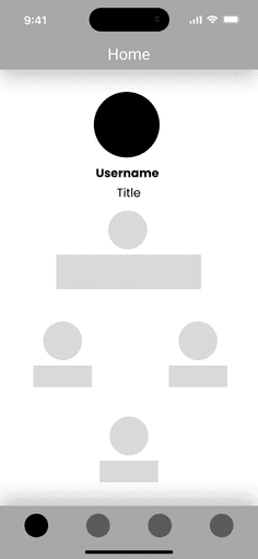
The wireframe assisted us in incorporating the interface into the design.
Assets
Some of the assets you see below have been desiguned using a minimilaistic and colour poping scheme.
Home Screens
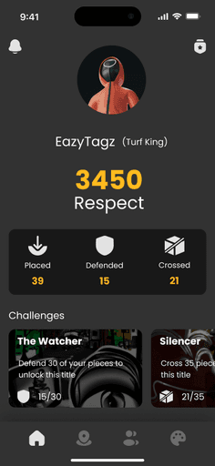
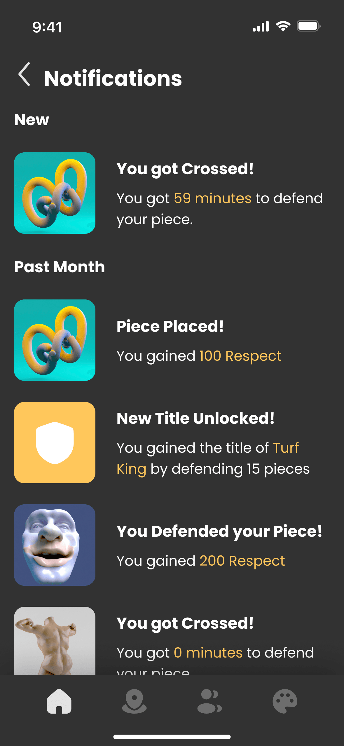
It offers users a quick overview of their in-app activities, including “Respect” points, challenges, and notifications. Users can track artworks placed, defended, and crossed, as well as monitor progress on ongoing challenges to stay engaged.
Map Screens
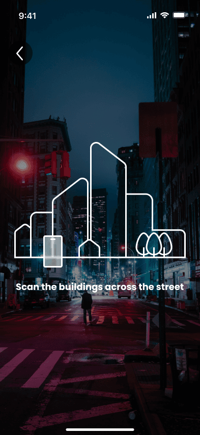
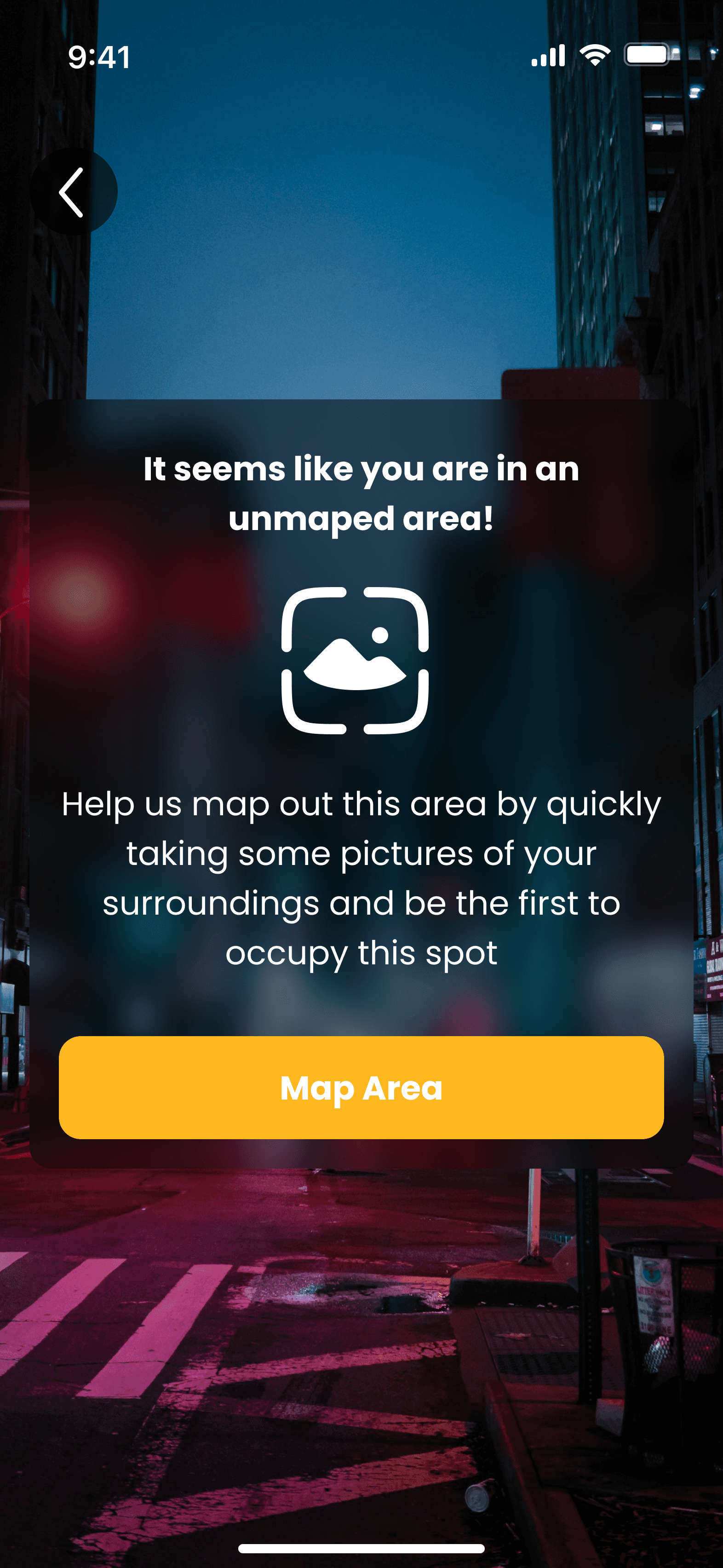
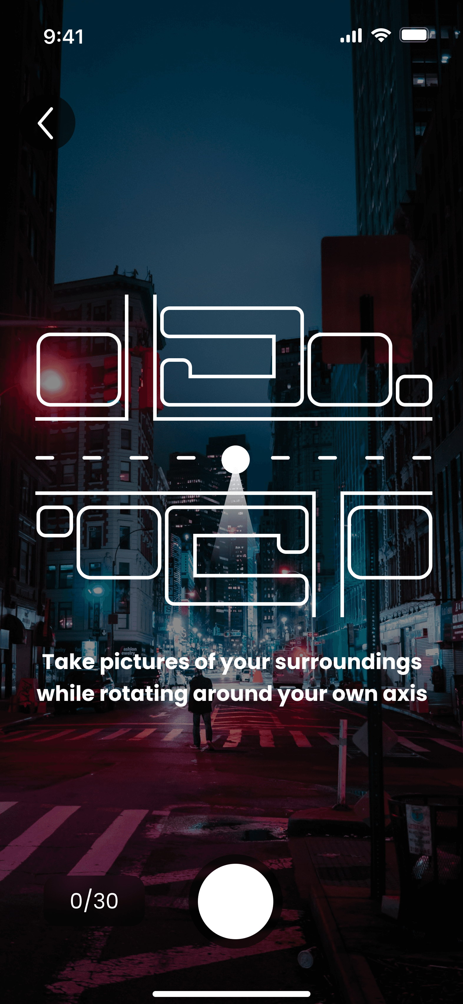
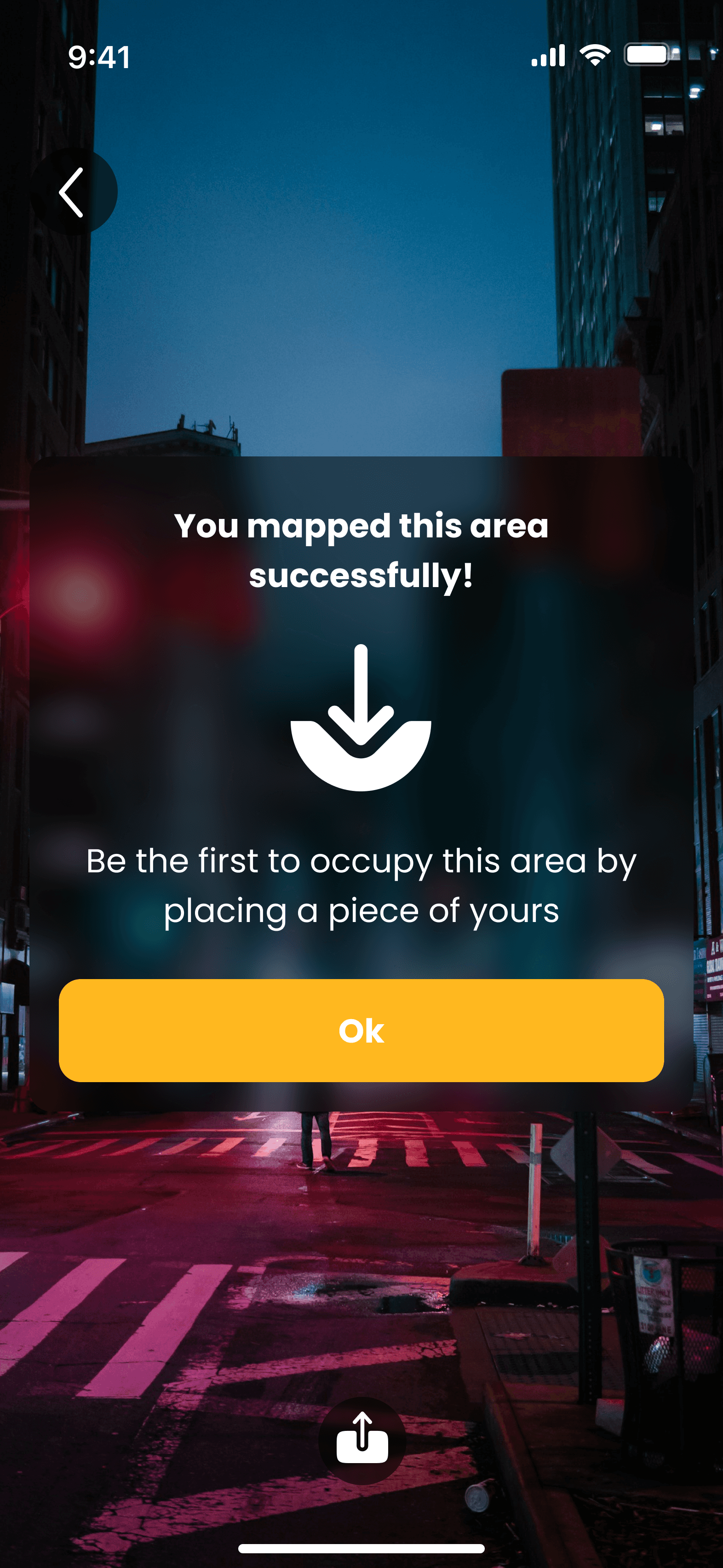
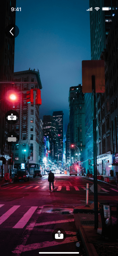
It guides users in discovering and claiming virtual territories in real-world settings. Users explore a city map, spot artworks, and claim unoccupied areas with step-by-step prompts for mapping and art placement. The intuitive interface and real-time feedback make exploring, creating, and defending art engaging and seamless.
Collection Screens
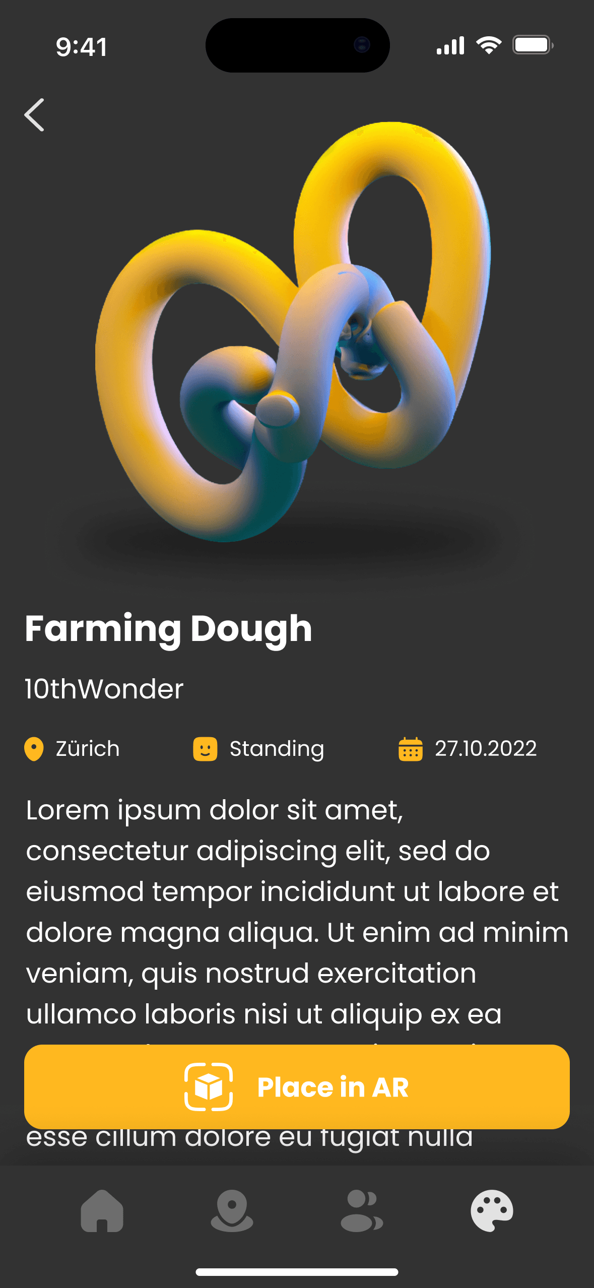
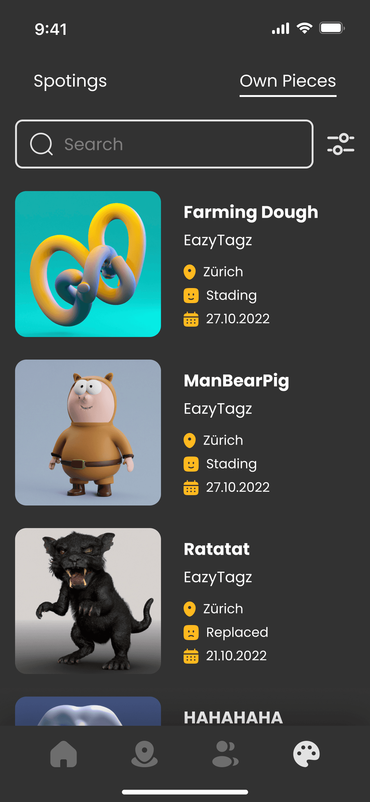
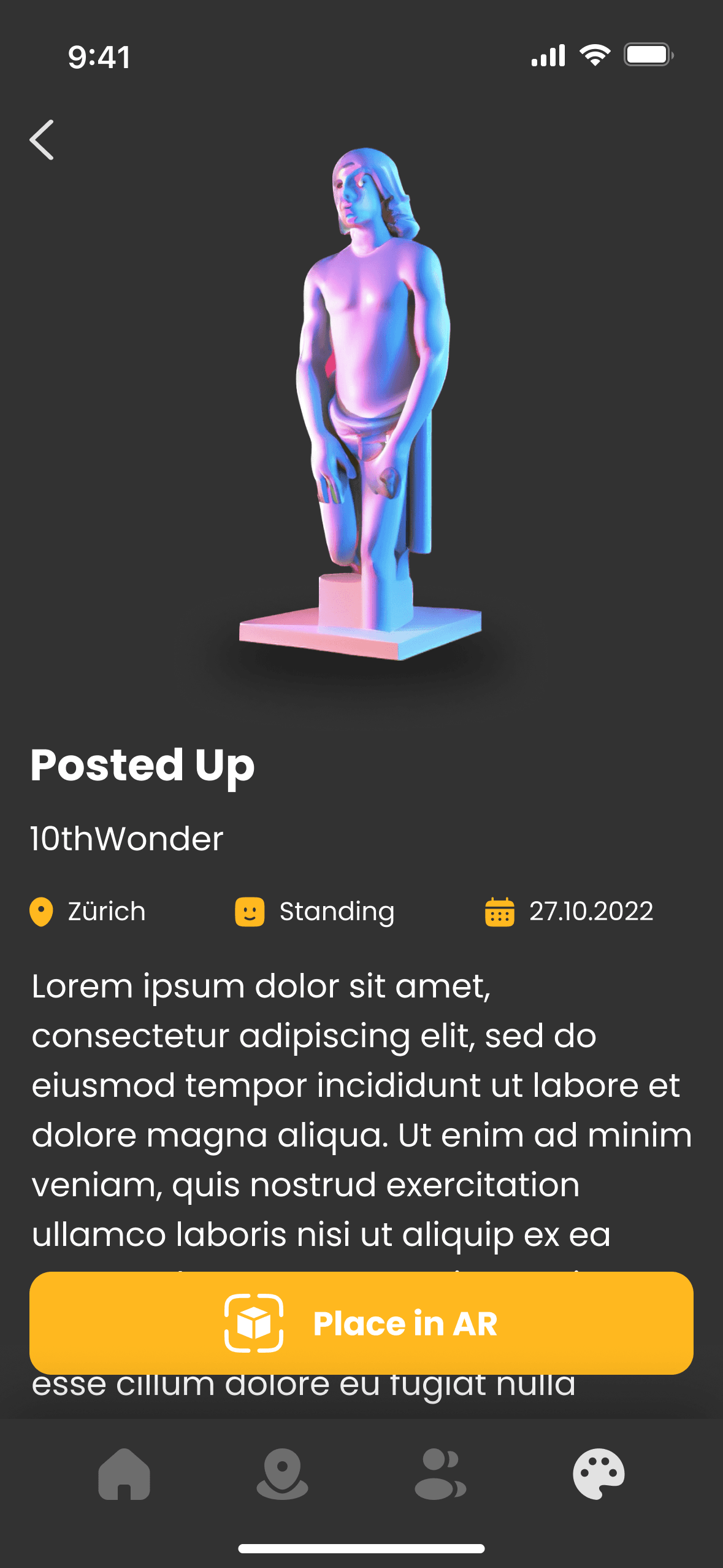
It lets users manage their digital artworks and view those created by others. Users can switch between discovered “Spotings” and their “Own Pieces,” with details on each piece’s location, creator, and defense status. The design offers easy navigation and a comprehensive view, keeping users engaged in their digital gallery and competitive strategies.
Contact Screens
It facilitates user interaction with easy access to individual contacts and crew groups. Users can search for friends, view crew affiliations, and check respect points to see their community ranking. This section fosters community-building by enabling users to add contacts, collaborate, compete, and network with like-minded artists in the digital art space.
Hololens 2 App
Beta is Almost Here! Stay Tuned for Launch
Under the guidance of MTC, we developed an application using Unity's Hololens 2 software development kit (SDK) for our project, Visible. In just two weeks, we crafted a beta hands-free interface that allowed users to switch between their left and right hands for drawing. The non-drawing hand served as a menu, offering options to choose colors, shapes, and upload 3D models. This project involved intricate development to enhance the user experience.


