Hoshii is an AI-powered workspace platform designed to simplify and streamline operations for wholesale distributors. It automates repetitive tasks like order processing, quote generation, and data transfer, enabling teams to focus on strategic activities. With seamless ERP integration, Hoshii provides real-time insights, helping businesses make smarter, faster decisions. The platform also identifies cross-selling opportunities and enhances customer interactions through AI-driven recommendations. Hoshii is the ultimate AI teammate, empowering distributors to save time, increase efficiency, and grow their business.
Project Type
SaaS Product Design
Ux & UI Design
Brand Guidelines
Branding
Marketing
Skills
Project Management
UX & UI Design
SaaS System Design
Information Architecture
User Experience Testing
Accessibility Research
Visual Identity Design
Design Library
Information Architecture
Usability Testing
User Interface Design
Client
My Role
UI & UX Design
Web Development
Brand Guidelines
Branding
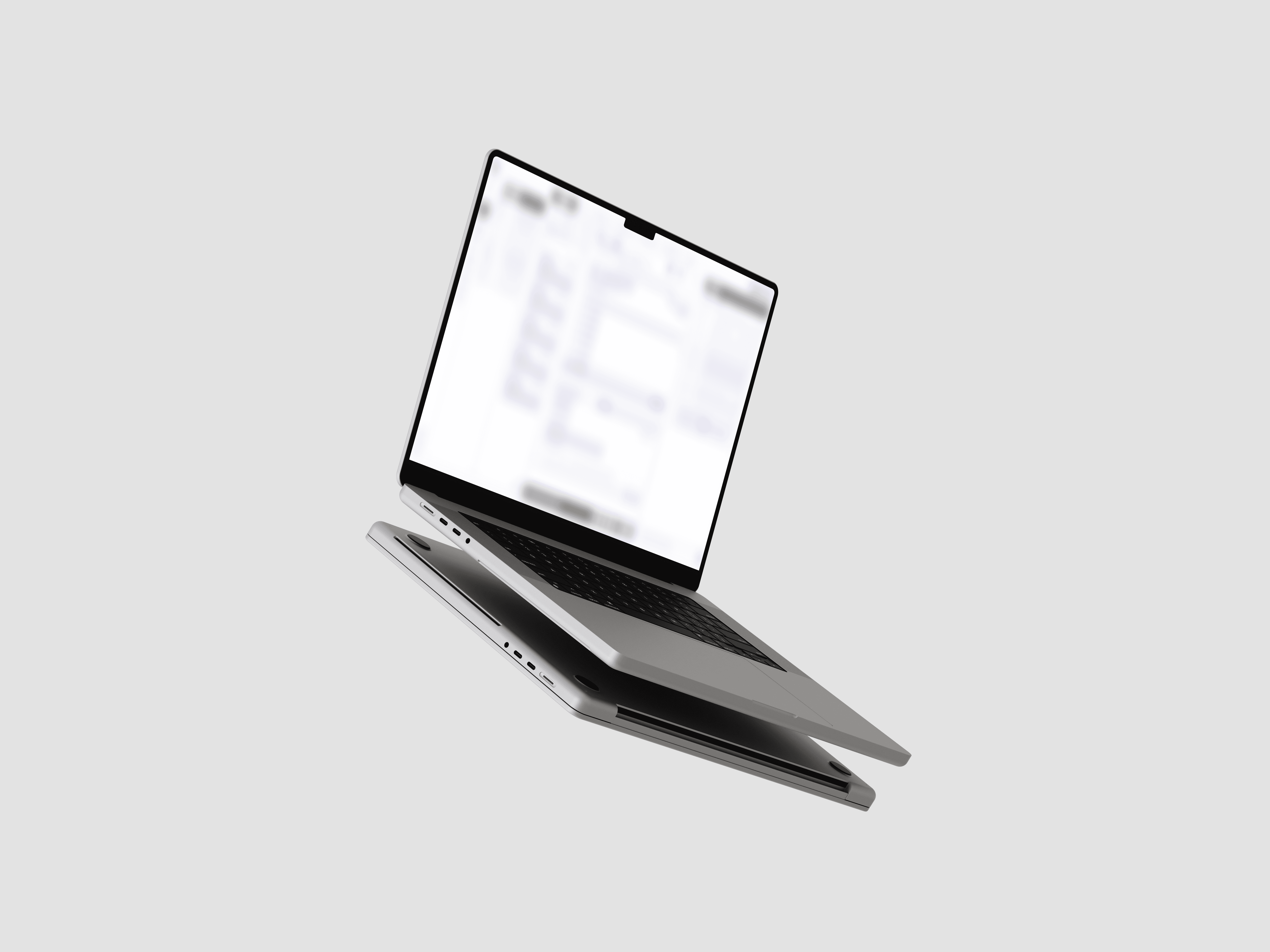
I led the UI/UX design and brand development for a SaaS platform, building a web app that feels as intuitive as it looks. From layout to interaction, I focused on simplicity, clarity, and empowering users to get things done with minimal friction.
Designing an email-driven system that feels effortless. The main hurdle was making complex wholesale workflows, usually slow and scattered, feel seamless and human by integrating an AI assistant into everyday tasks.
Wholesale employees who manage large volumes of operational emails and manual processes. They need a tool that simplifies their workload, reduces mental load, and helps them reclaim time for higher-level thinking.
Solution
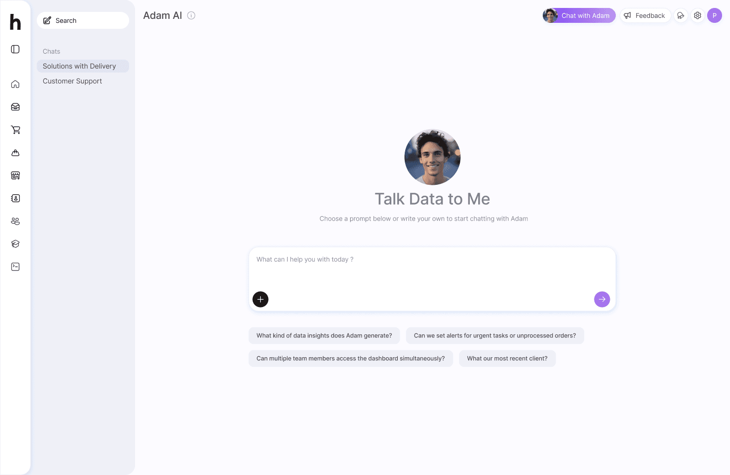
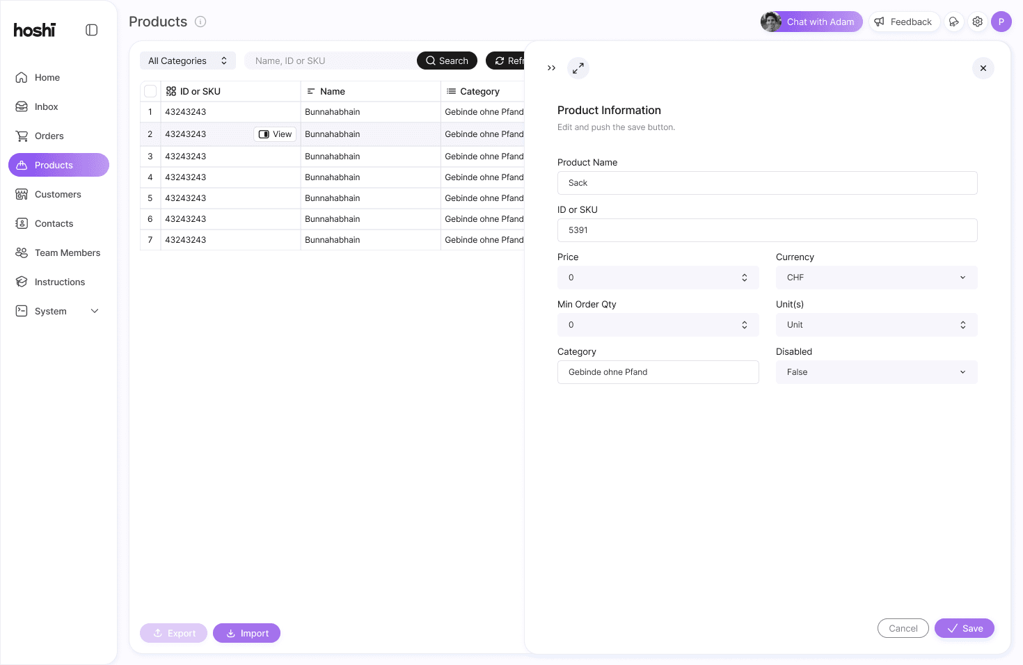
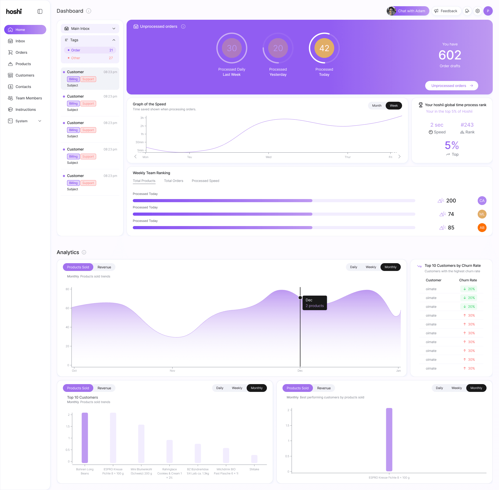
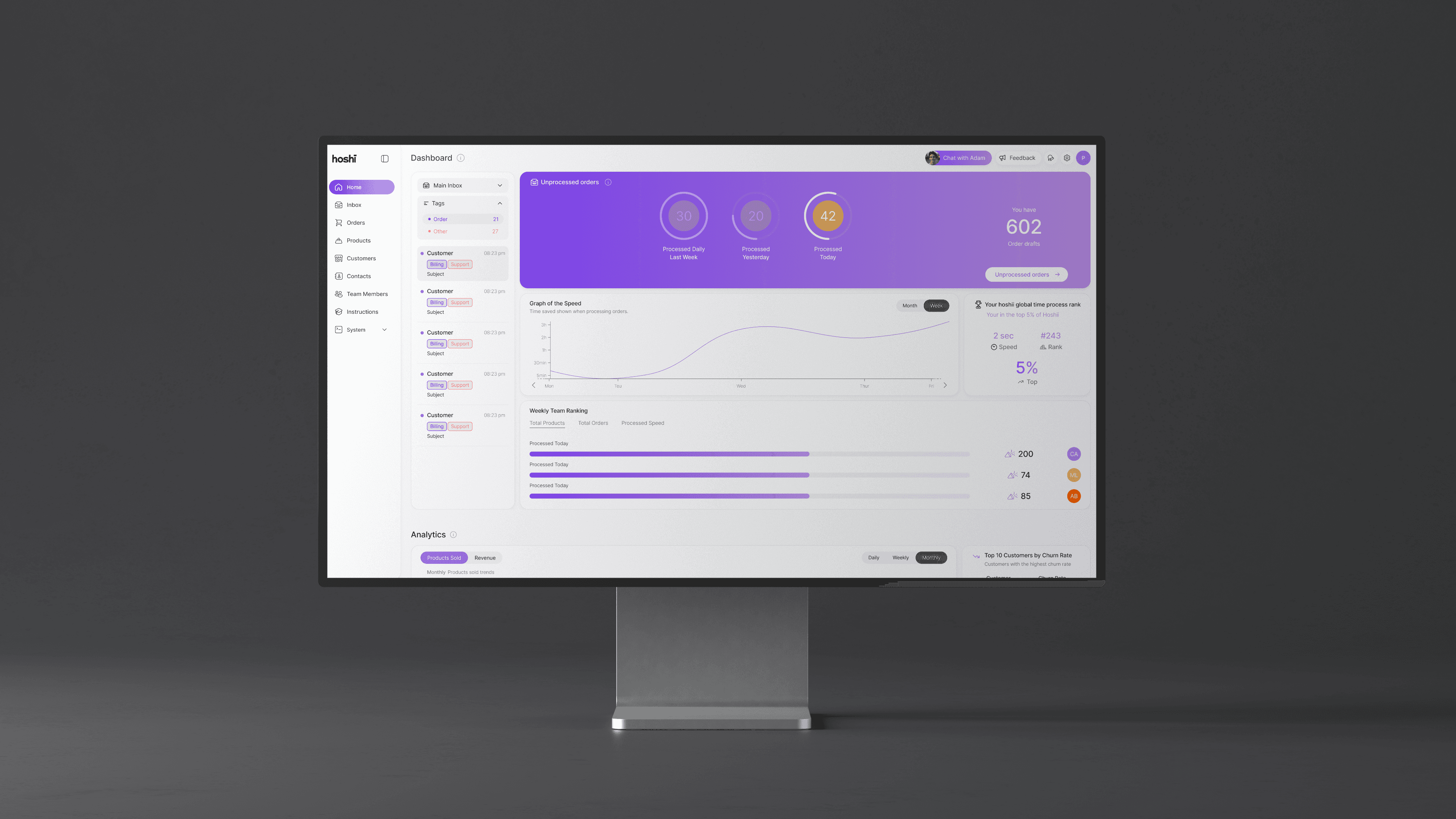
Hoshii cuts through the noise by transforming inbox chaos into structured action. By syncing with ERP systems and powered by an AI teammate (Adam), users can automate routine steps like quotes, follow-ups, and order handling, freeing up time for what really matters: strategy, insight, and growth.
Research
Our research for Mimic Robotics focused on understanding how to visually and functionally position a deep-tech robotics company at the intersection of AI, autonomy, and dexterous manipulation. We explored how to translate technical depth into a compelling, accessible digital identity that resonates with both investors and engineers.
Market and Workflow Analysis
We analyzed how wholesale teams currently manage inbox-heavy workflows such as quotes, follow-ups, and order coordination.
What we looked at
Existing ERP and email integrations
Productivity tools used in wholesale environments
AI assistants in B2B SaaS
Workflow automation competitors
Why it mattered:
Most solutions were either overly complex, visually outdated, or disconnected from real daily workflows. This revealed an opportunity for Hoshii to combine automation with clarity and usability.
User Research and On-Site Observation
Persona
We conducted interviews with founders, team members, and early users. We also visited sponsors and angel investors to observe how communication and task management actually happens in real environments.
Methods:
Contextual interviews
On-site shadowing
Workflow mapping sessions
Workflow automation competitors
Key insights:
Inbox overload slows down revenue-driving work
Users want automation without losing control
Speed matters, but trust and transparency matter more

Laura Meier
Age
12-year-old
Role
Operations Manager
Location
Zurich
Tech Literate
Experienced
Mention
"I’m all about turning blank walls into something amazing. Whether it’s sketching up some graffiti or exploring new spots with my friends, I’m always creating. Mixing that with tech would be next-level, and the chance to do it together would be unreal."
Personality
Analytical, pragmatic, responsible, efficiency-driven. Values reliability over hype.
Bio
Laura oversees daily order processing, quotes, and supplier communication. Her inbox is constantly full, and much of her day is spent switching between email and ERP. She is detail-oriented, responsible for revenue flow, and accountable for operational efficiency. She values structure, clarity, and tools that genuinely reduce workload rather than add complexity.
Core Needs
Workflow Visibility Clear overview of open requests, quotes, and follow-ups.
Automation Without Risk AI support that assists, but keeps her in control.
ERP Integration Seamless connection between inbox and internal systems.
Time Efficiency Reduce repetitive tasks to focus on team coordination and growth.
Frustrations
Manual copy-paste between email and ERP.
Losing track of follow-ups in long email threads.
Overloaded inbox with unstructured requests.
Tools that promise automation but create more setup work.
Product and Experience Strategy
We translated insights into structured UX decisions.
Defined interaction principles to ensure every action feels intentional, fast, and understandable.
Focus areas:
Clean, frictionless dashboard experience
Clear AI teammate positioning
Reduced cognitive load in email workflows
Modular and scalable interface architecture
Brand and Positioning Research
Hoshii was not just a product build. It required repositioning.
The rebranding ensured Hoshii feels intelligent, calm, and future-ready without appearing overly technical or cold.
We explored:
Naming and tone alignment
Visual differentiation in a crowded SaaS space
Investor-facing clarity
Balancing technical depth with approachability
Information Architecture
User Flow
Automation Logic
Visual & System Identity
Hoshii was designed as a smart layer between inbox and ERP. The system transforms unstructured emails into clear, actionable workflows. User flows prioritize speed, control, and transparency, while the visual language reinforces trust, precision, and enterprise readiness.
App User Flow
Information Architecture
We mapped the complete journey from incoming email to resolved workflow. Every step was sketched and stress-tested to reduce friction, clarify decision points, and ensure users always understand what the system is doing and why.

User Flow coming soon…
System Thinking
Hoshii is not just an interface. It is an operational layer. We designed it as a connected system between inbox, ERP, CRM, and internal processes. Each action triggers structured logic, turning unstructured communication into measurable business flow.
Experience Architecture
We structured the experience around clarity, control, and confidence. The architecture prioritizes transparency in automation, intuitive navigation, and progressive disclosure so users feel empowered rather than replaced by AI.
Branding
Logos
Icon Library
Colour Scheme
Hoshii’s branding is built around clarity, structure, and digital precision. A clean visual system, confident typography, and a focused color palette create a scalable identity designed for fast workflows, intelligent automation, and modern SaaS environments.
At Hoshii, we believe in pushing boundaries to create breakthrough solutions that empower businesses. Our brand stands for innovation, efficiency, and reliability, all wrapped in a user-centric design that makes advanced technology feel effortless.
Our mission is to evoke the true power of AI—making it both trustworthy and pioneering. We aim to deliver an experience that feels fresh and dynamic, much like how Spotify redefined simplicity and engagement.
These guidelines capture the essence of what Hoshii is all about: a brand that’s not just enterprise-worthy but one that leads the way with a bold, youthful spirit. As you explore, you’ll find the principles and design elements that ensure every interaction with Hoshii feels authentic, seamless, and forward-thinking.
Hoshii Brand Values
1. Innovation
2. Efficiency
3. Reliability
4. User-Centric Design
5. Breakthrough / Enterprise Worthy
6. Feeling of Being a Pioneer / Innovative
7. Evoke AI
8. Trustworthy
9. Fresh & Young
Hoshii’s Brand Personality:
Corporate / Modern
Friendly, Professional, Confident
Gamified (Playful)
Minimalistic
Moodboard
Curated moodboard to define Hoshii’s visual direction across product, brand, and interface. The references explore clean SaaS dashboards, modular UI systems, bold accent colors, and structured layouts.
The goal was to balance clarity and intelligence with energy and confidence. A system that feels powerful, modern, and operational, yet intuitive and human.

Logo
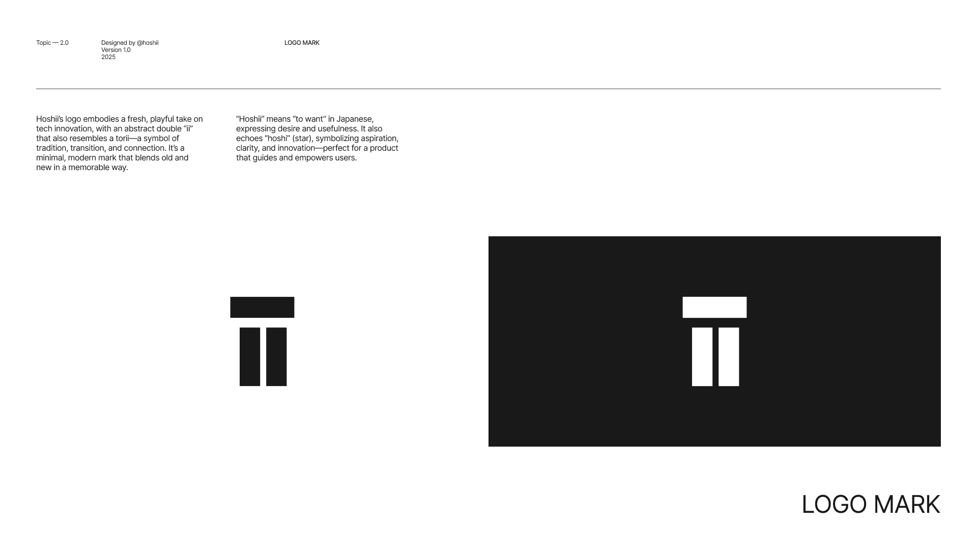
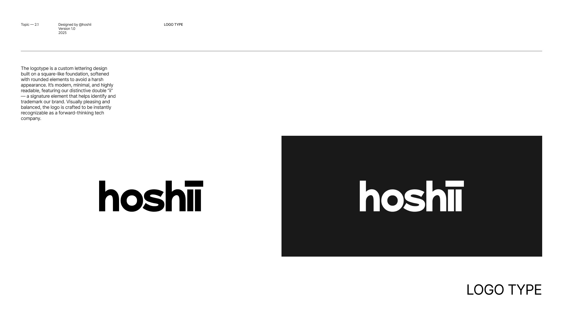
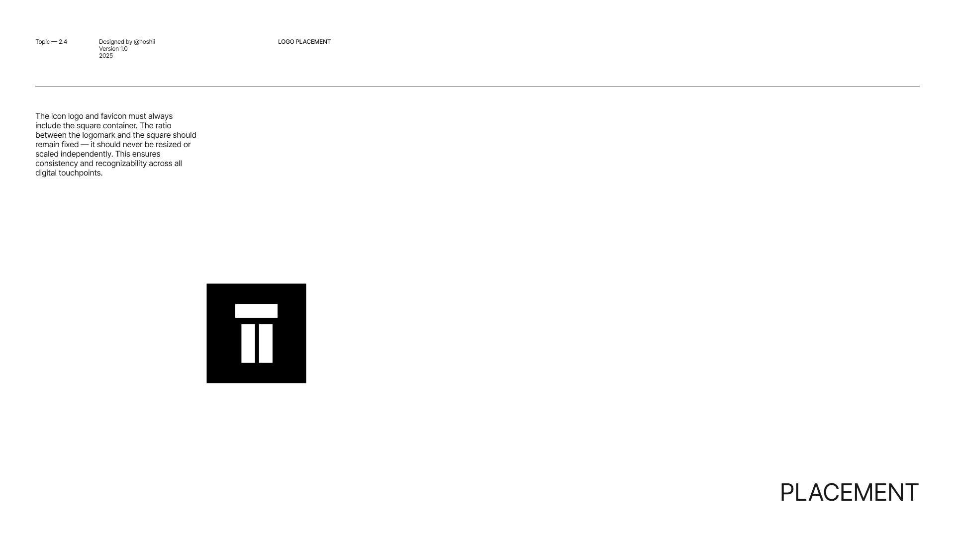
The Hoshii logo is a custom wordmark built on a modular, square-based foundation that creates balance, clarity, and strong visual structure. Its distinctive double “ii” serves as a signature element, forming a subtle symbol that enhances recognition and brand identity. Minimal yet confident, the mark is designed to scale seamlessly across digital touchpoints while reflecting precision, innovation, and a modern product-driven mindset.


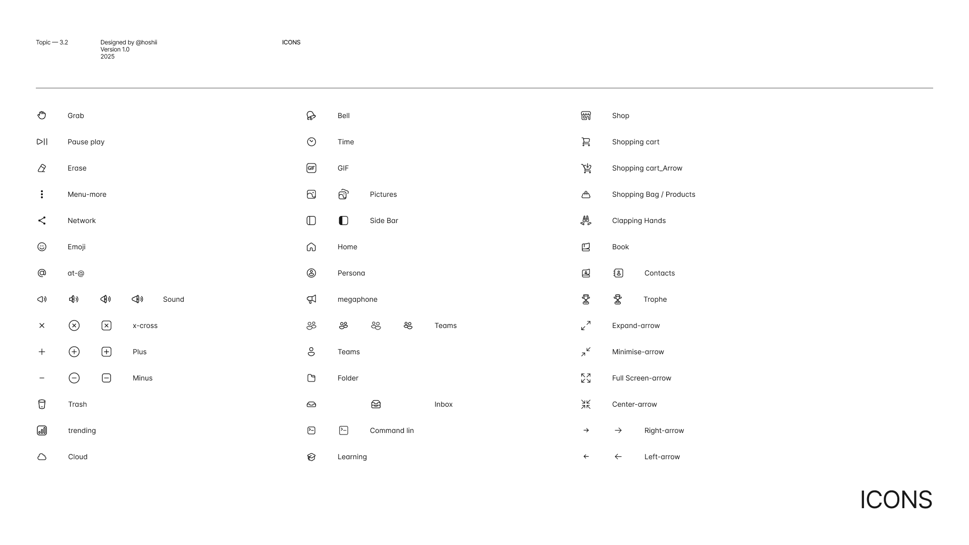
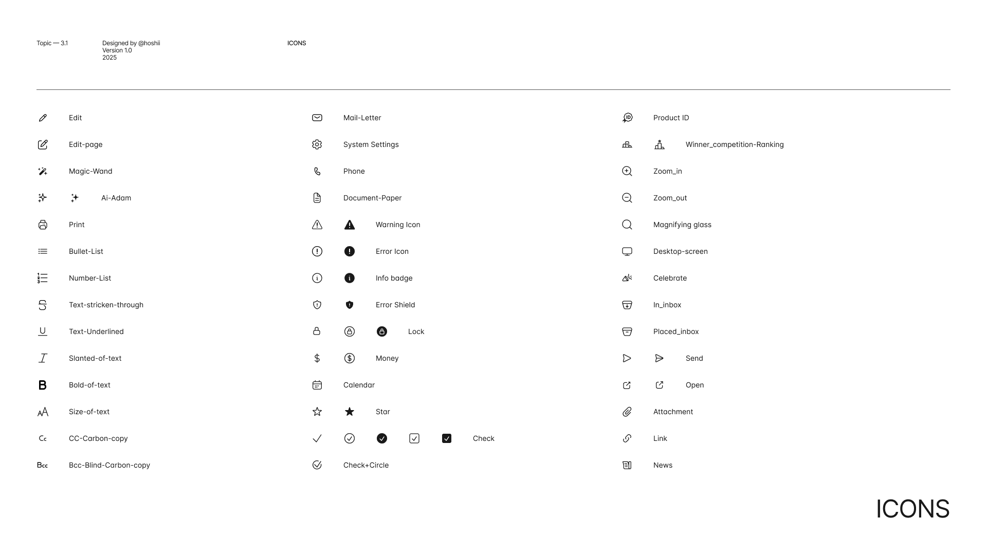
Icons
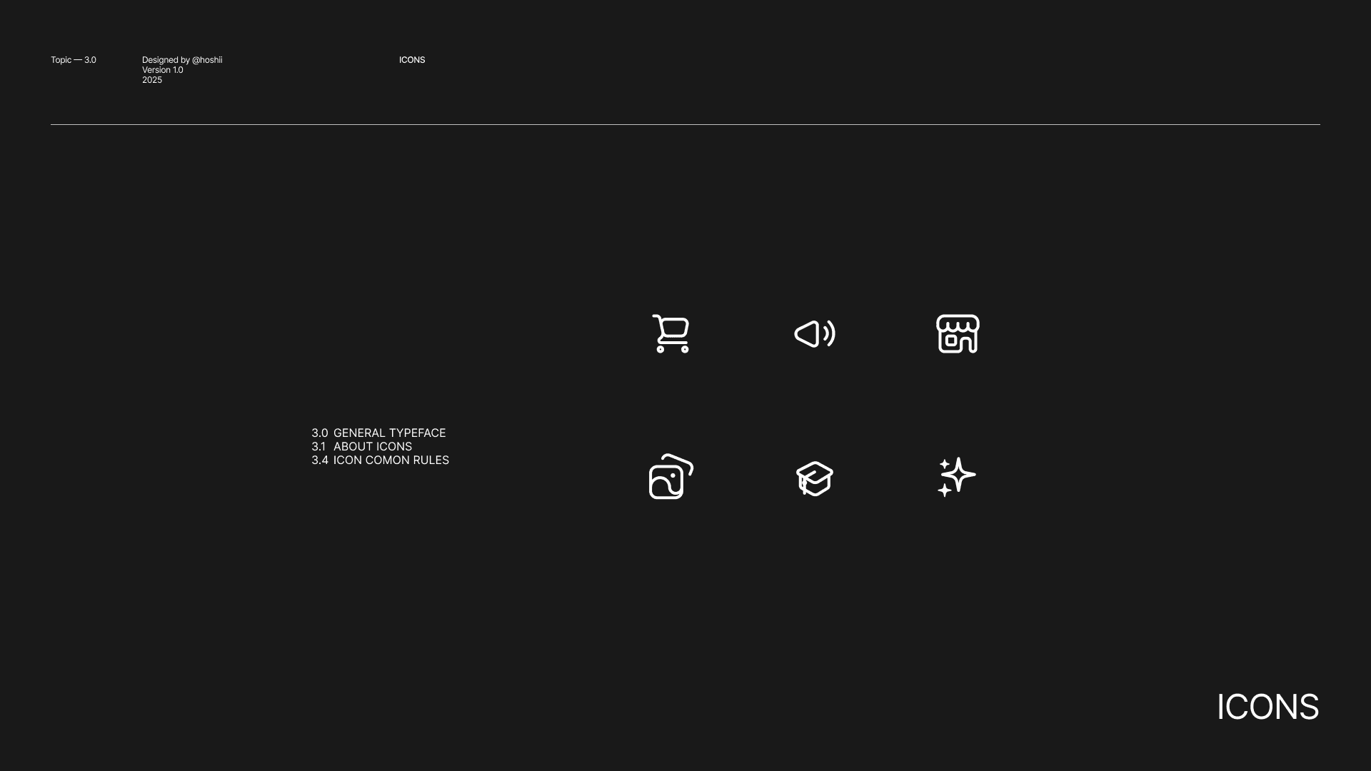
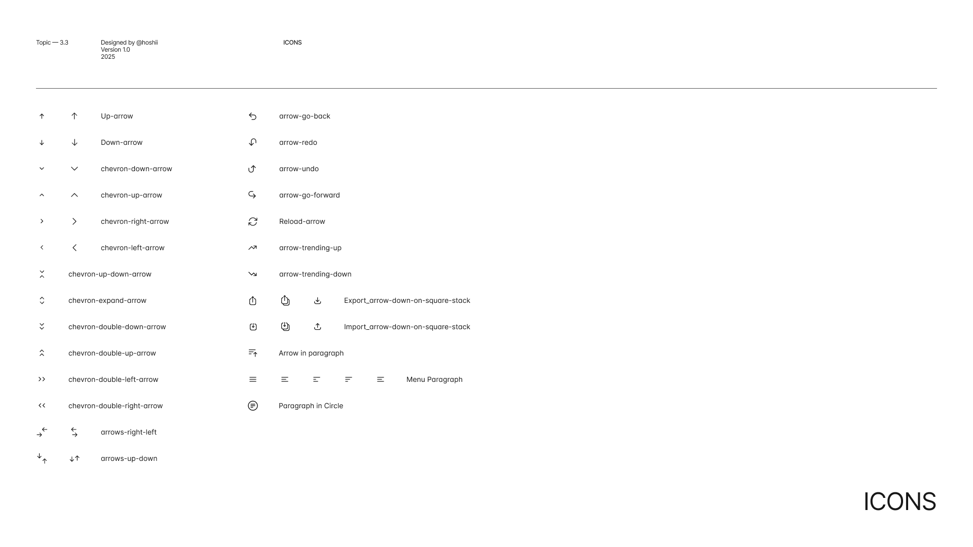
The Hoshii icon system is clean, minimal, and consistent. Each icon is built on a 24 by 24 grid with balanced line weight and rounded edges to ensure clarity at every size. Together they create a simple, structured visual language that supports usability and strengthens the overall product identity.


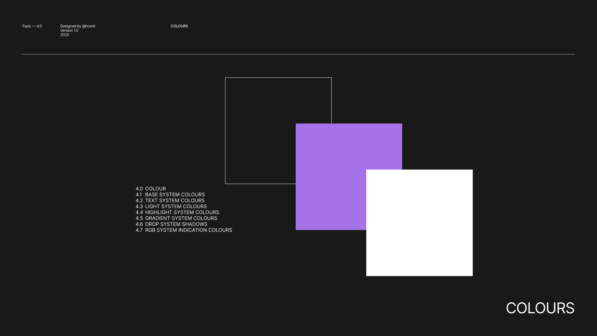
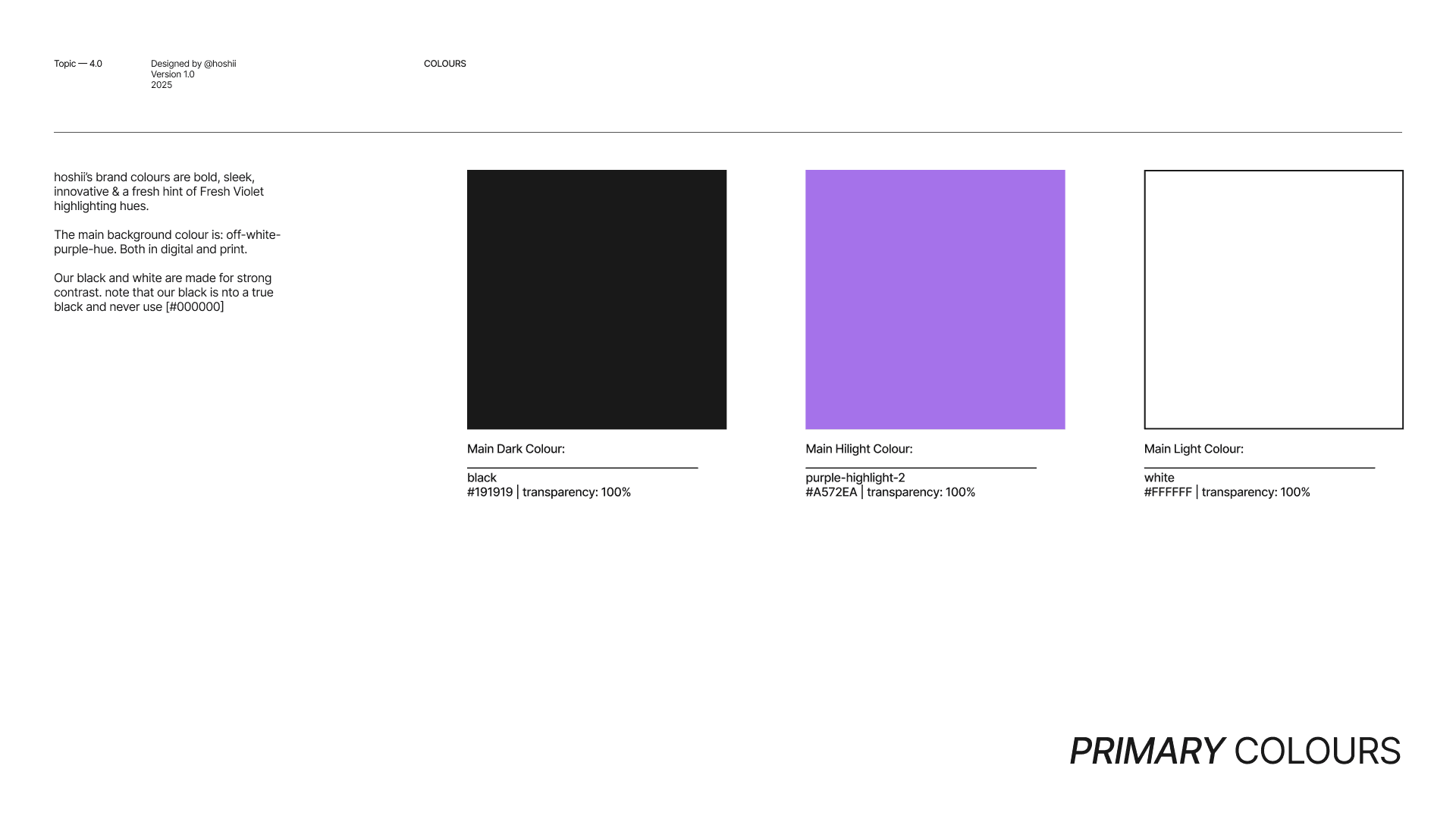
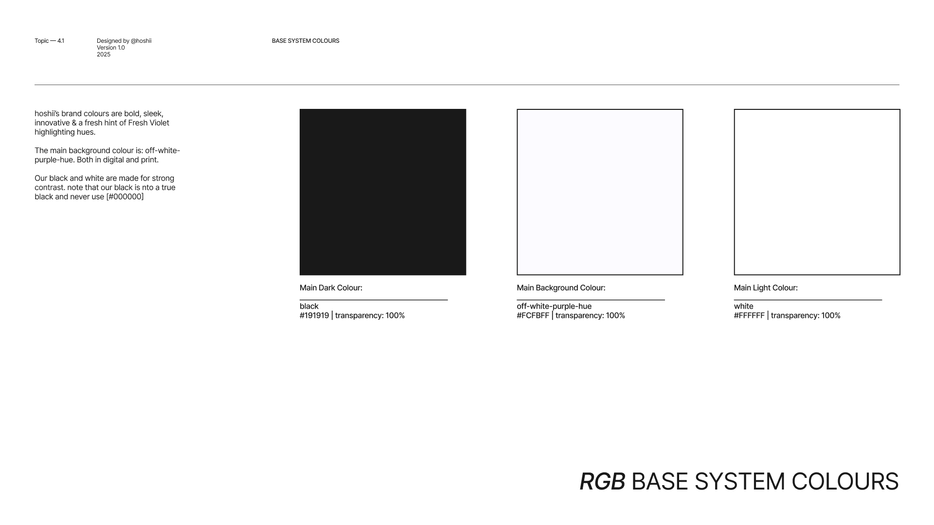
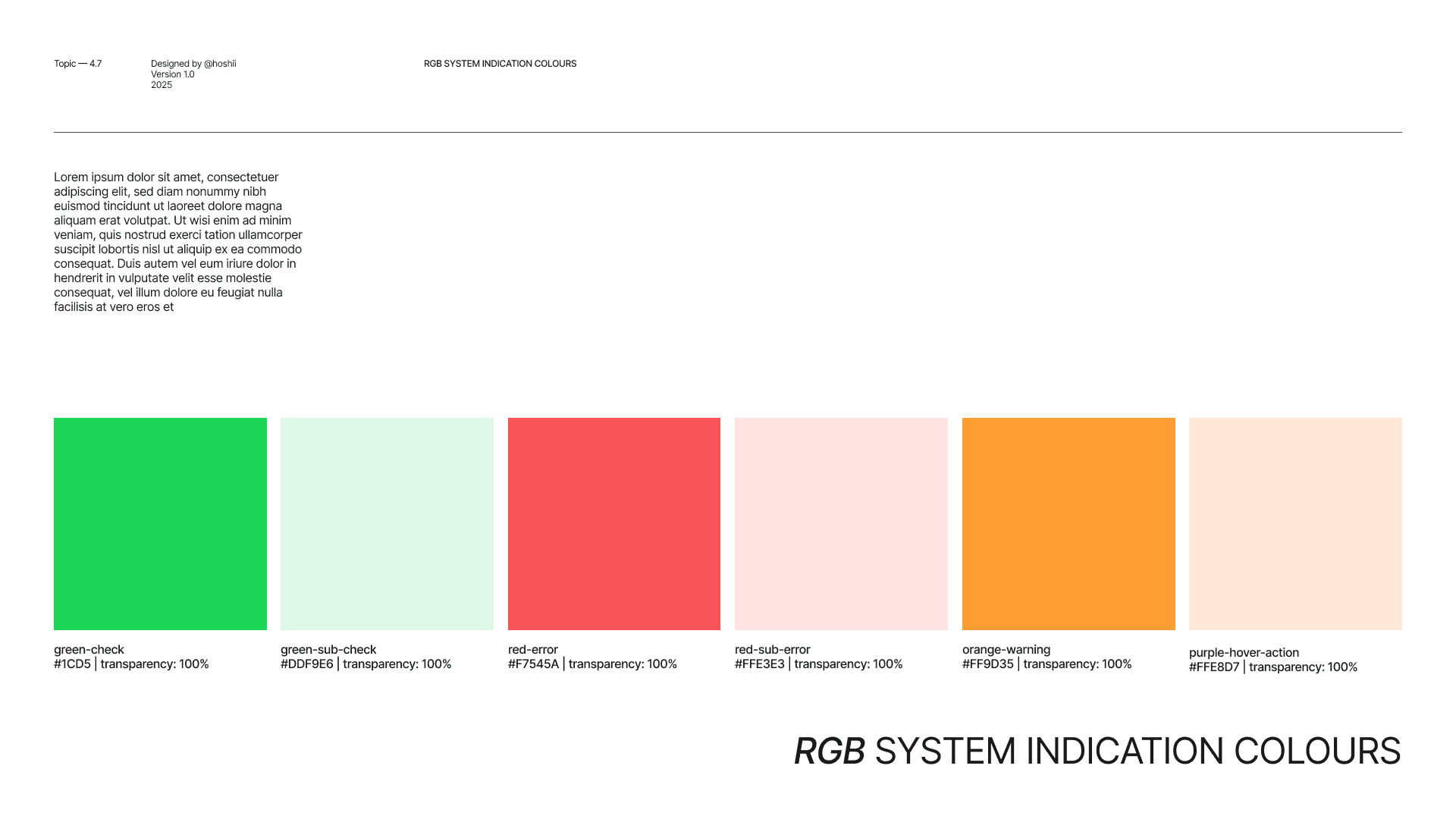
Colours
Hoshii’s colour system is built on contrast and clarity. A deep, softened black creates a strong and confident foundation, while the fresh violet highlight introduces energy, innovation, and a subtle sense of intelligence. Together, they balance precision with creativity, giving the interface a modern, focused, and distinctive presence.


Font
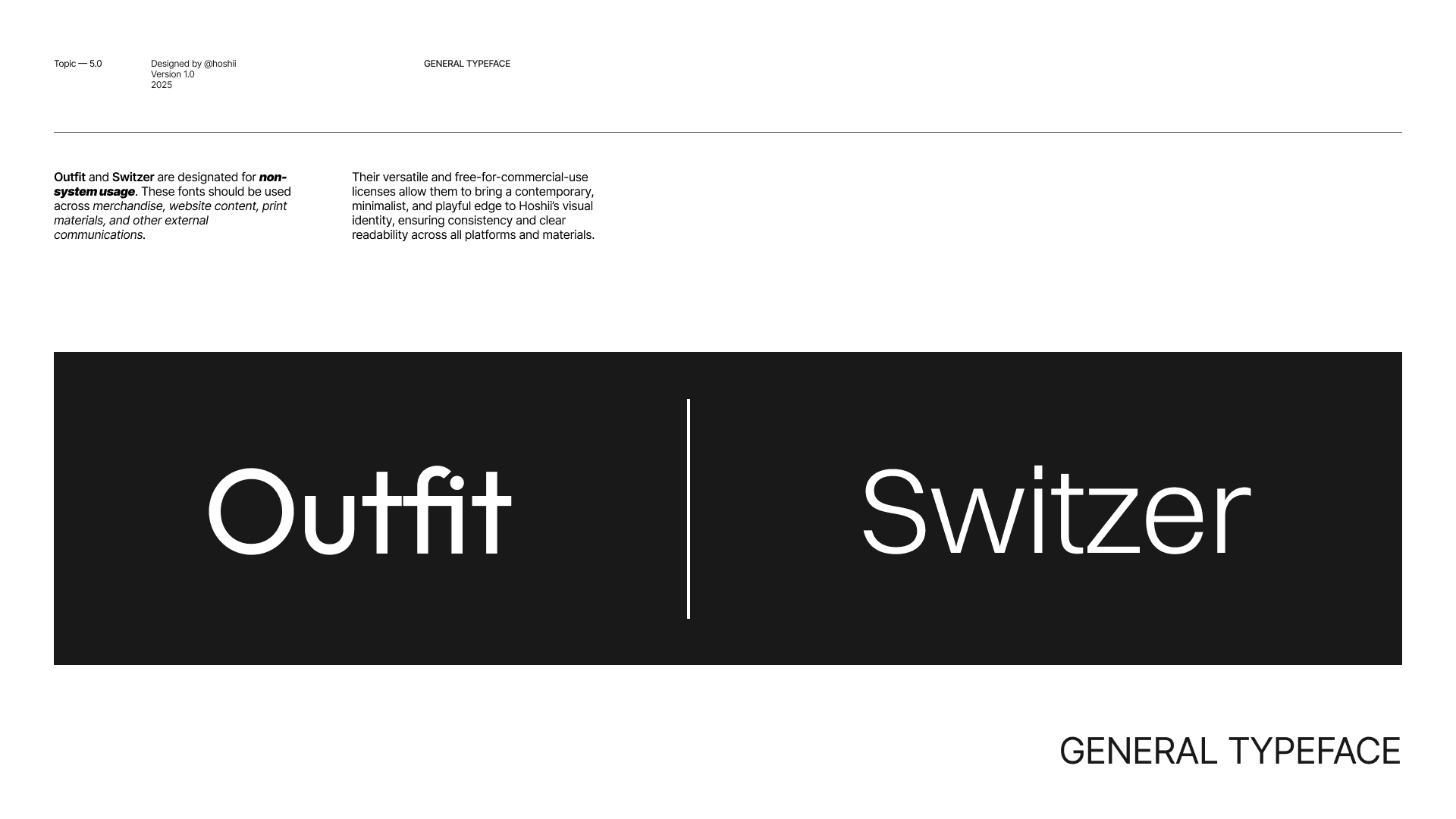
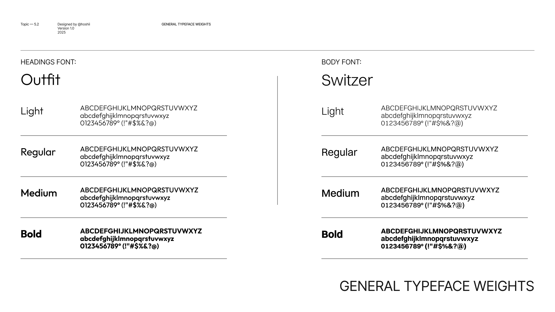
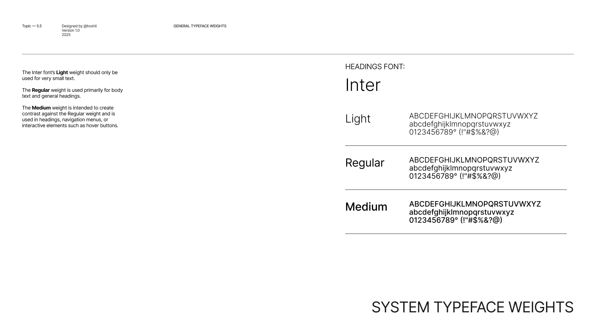
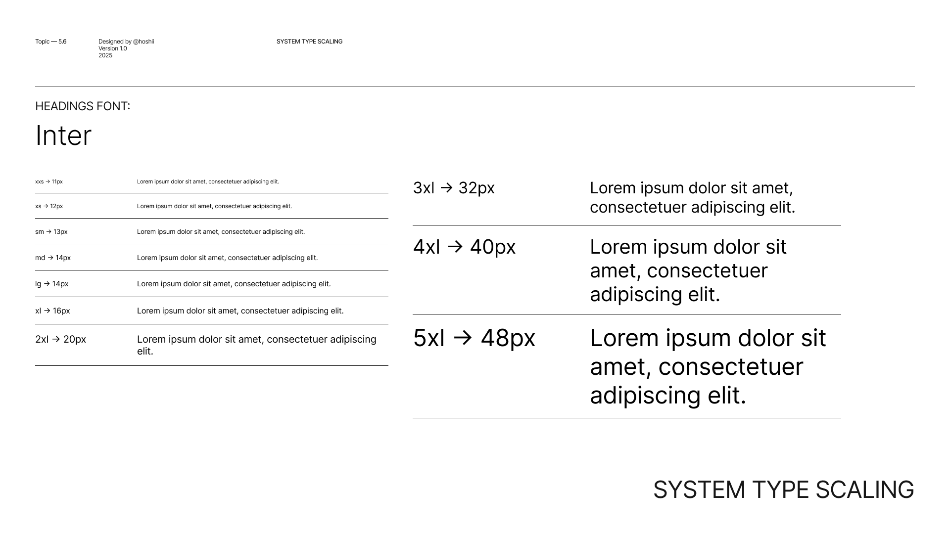
Hoshii’s typography balances clarity with character. Outfit is used for headlines to create confident, structured impact, while Switzer supports body text with high readability and a clean, contemporary tone. Inter functions as the system typeface within the product, ensuring consistency across the interface. Together, the type system delivers hierarchy, usability, and a modern visual rhythm across all touchpoints.


Web design
System Design
The app design prioritizes user-centric navigation, making it easy to create, place, and defend digital artworks in real-world spaces. It enhances accessibility and creativity for seamless interaction between digital and physical environments.
Web-App design
System Design
The app design prioritizes user-centric navigation, making it easy to create, place, and defend digital artworks in real-world spaces. It enhances accessibility and creativity for seamless interaction between digital and physical environments.