Back

Website, brand identity, illustration

SurgeTix
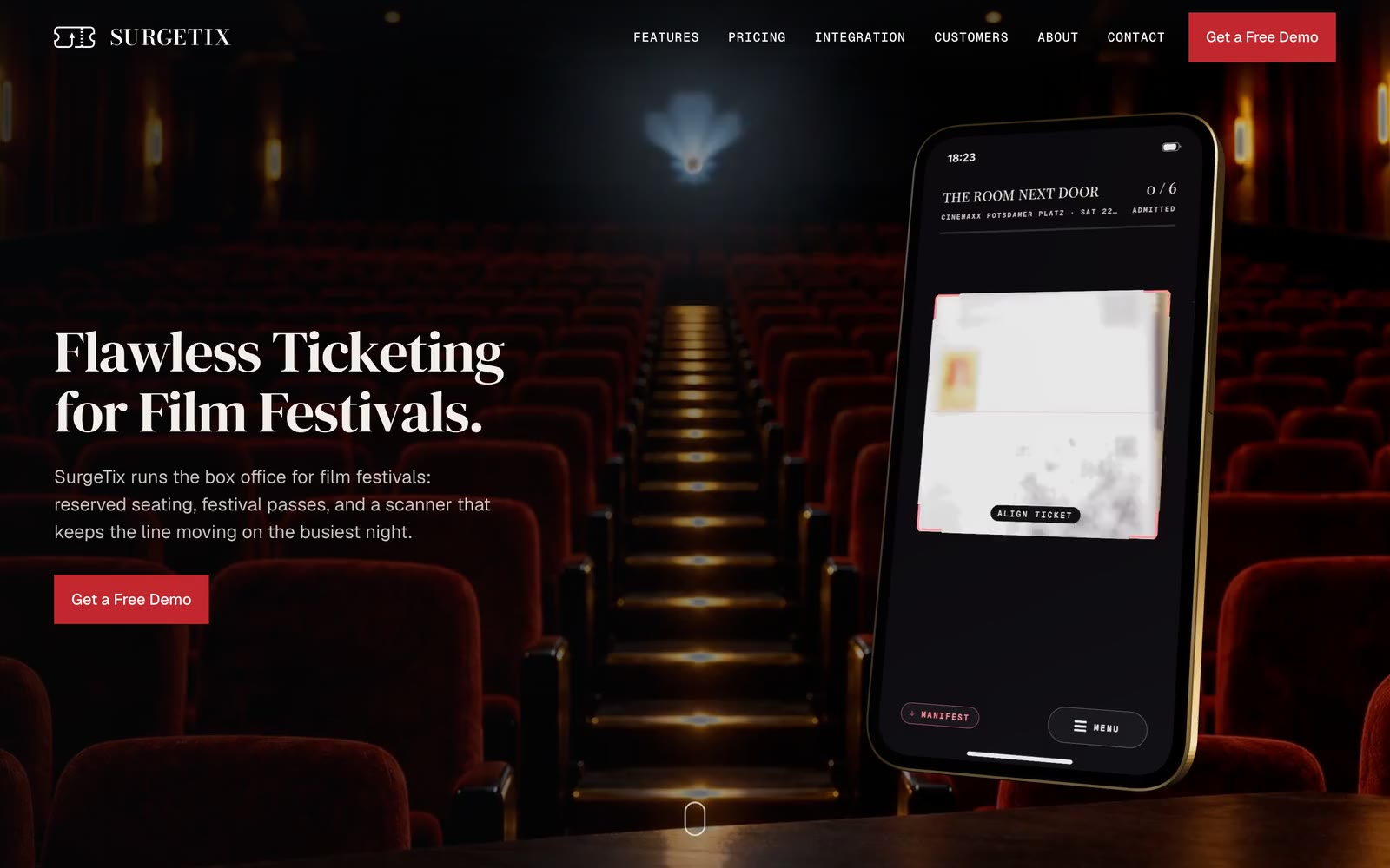
The SurgeTix home page: the headline Flawless Ticketing for Film Festivals and a red button on the left, a phone with a scanner app on the right, over rows of red cinema seats.
Studio
Nemu & Co.
Year
2026
Scope
Front end and design work
Website
Designed in Framerrebuilt in code (SolidJS, Vite, TypeScript)
Motion
Rive animations, live on the site

Short read

Brand identity

Website

A code rebuild of the SurgeTix marketing site from the Framer design, with a cinematic loading and curtain intro and live Rive feature animations.

Captures of the live site, surgetix.com, 21 October 2026.

Hero

Flawless Ticketing for Film Festivals.

A full bleed cinema clip behind the copy column, and an interactive 3D phone on the right that tilts toward the cursor while its screen plays a looped clip of the app. One call to action: Get a Free Demo.
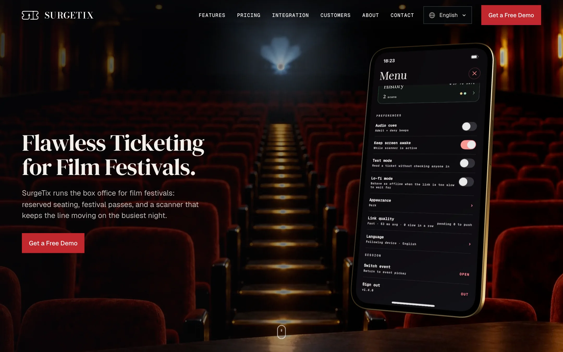
The top of the SurgeTix home page: the navigation with the logo, six links, a language picker and a red Get a Free Demo button; the headline Flawless Ticketing for Film Festivals in a large serif, a line of text and a red button on the left; a phone in a gold frame on the right showing a scanned ticket marked Admitted, over a dim cinema hall with red seats.
Hero, Home page, 1440 wide
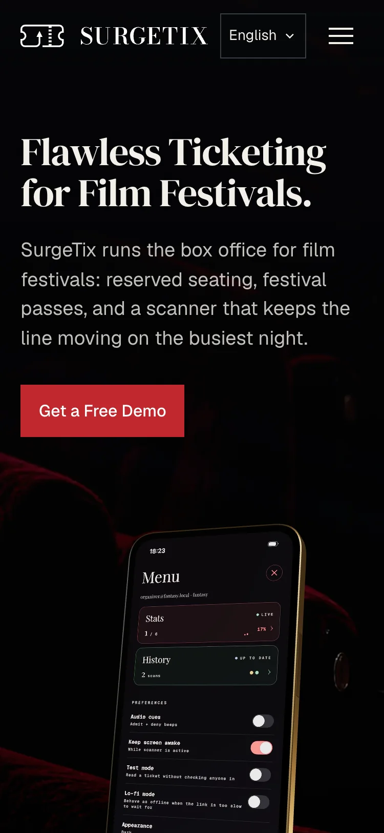
The same hero at phone width: the logo and a menu button, the headline over three lines, the text, the red button, and the top of the phone below.
Hero, phone, 375 wide

The platform features

Built to run the whole edition.

A compact grid of the key capabilities. Each card leads with its live Rive animation, then a title and a subtitle; any card expands to show how it works, and the grid feeds into the full features page.
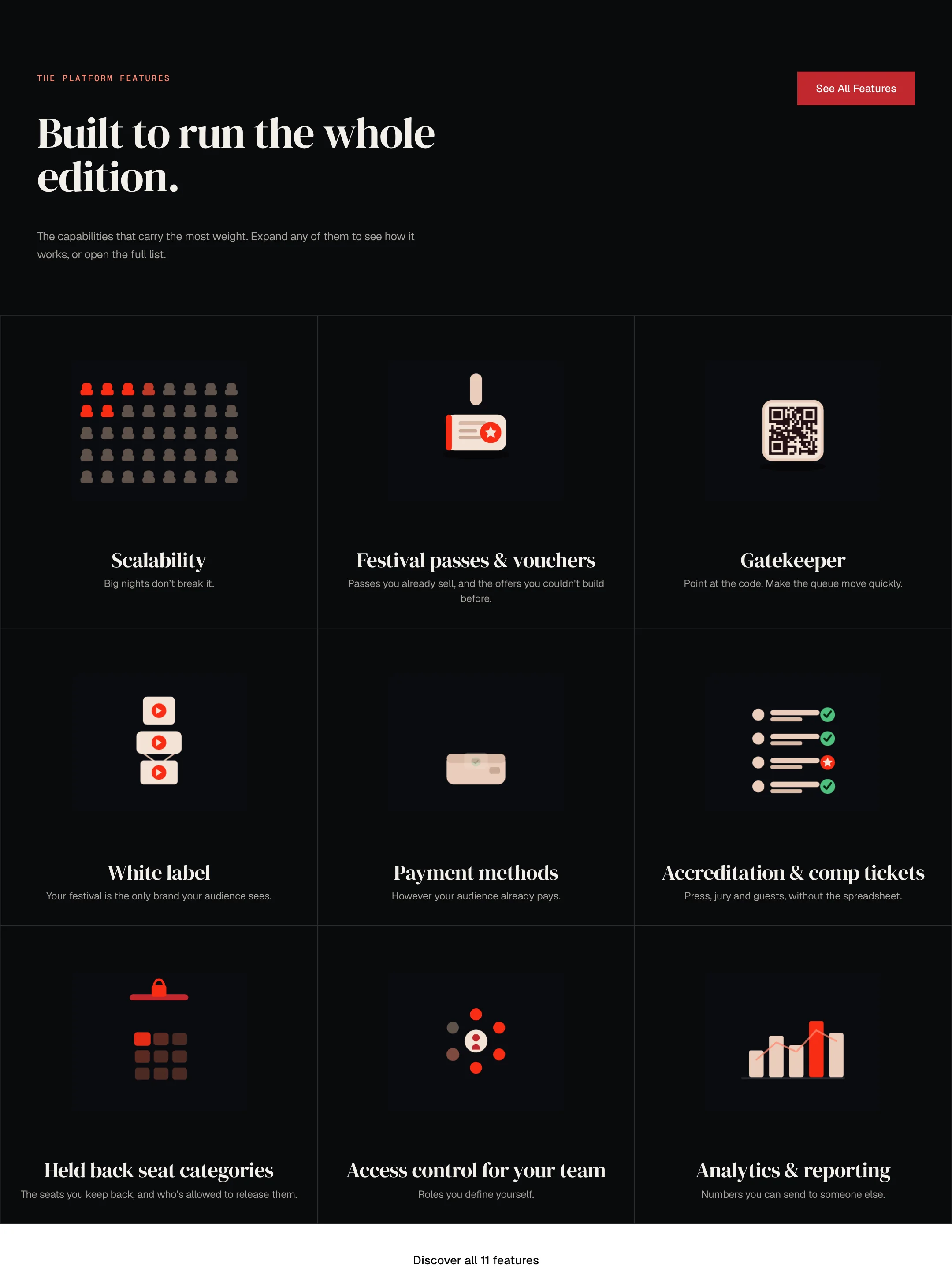
The features section on a near black ground: the label The platform features, the serif headline Built to run the whole edition, a red See All Features button, and a grid of nine cards, each with a small drawing in red and cream above a serif title and one line: Scalability, Festival passes and vouchers, Gatekeeper, White label, Payment methods, Accreditation and comp tickets, Held back seat categories, Access control for your team, Analytics and reporting. A white band below reads Discover all 11 features.
The platform features, Home page, 1440 wide

The dashboard

Live operational intelligence.

The admin cockpit, kept as its own section: a live 3D laptop showing the dashboard the operator runs the edition from. It lifts and expands on hover.
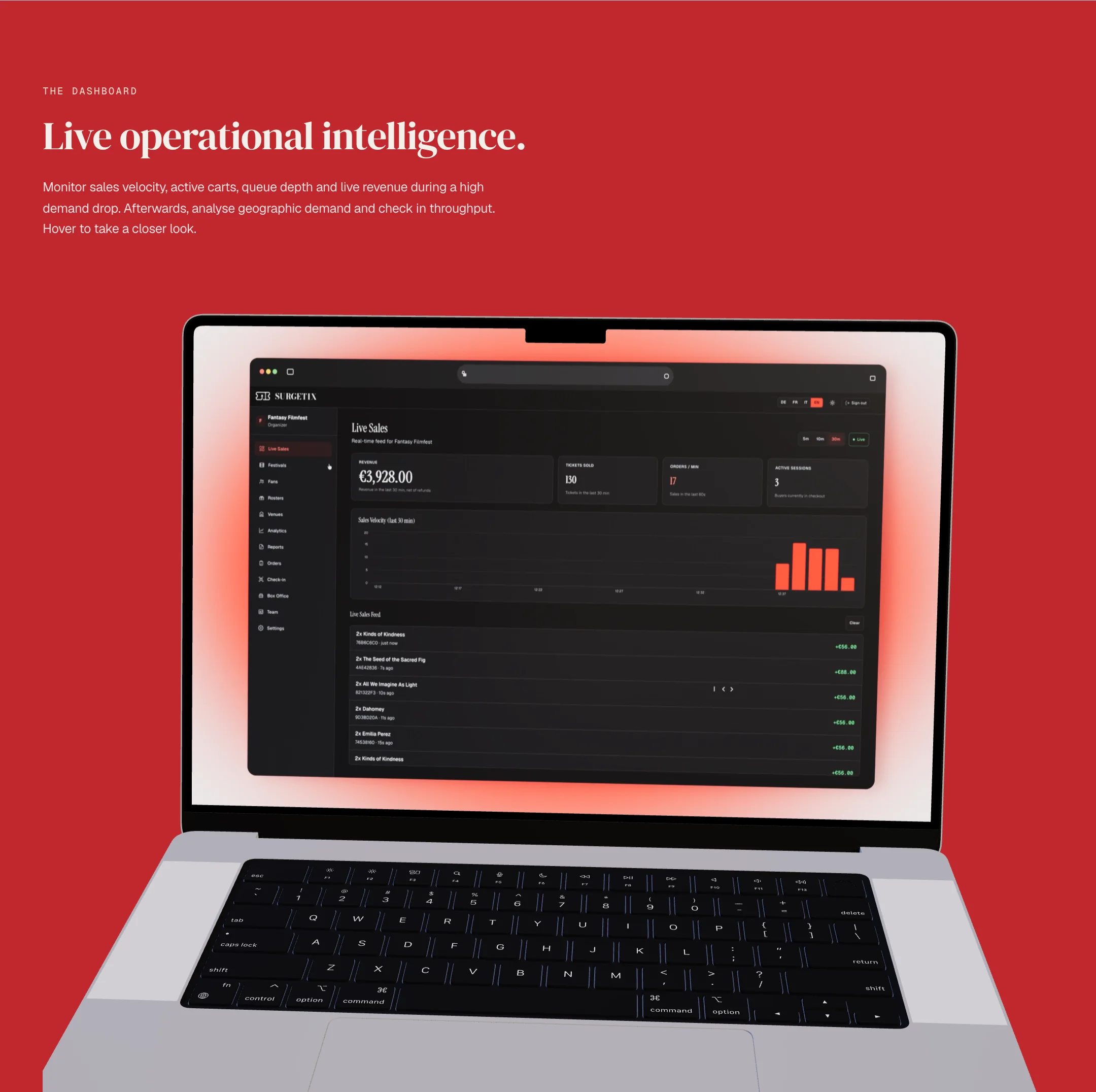
A red section: the label The dashboard, the serif headline Live operational intelligence and a short text, above a silver laptop whose screen shows a dark dashboard titled Live Sales with revenue, tickets sold, orders per minute, a bar chart in red and a feed of sales, with a soft red glow behind the screen.
The dashboard, Home page, 1440 wide
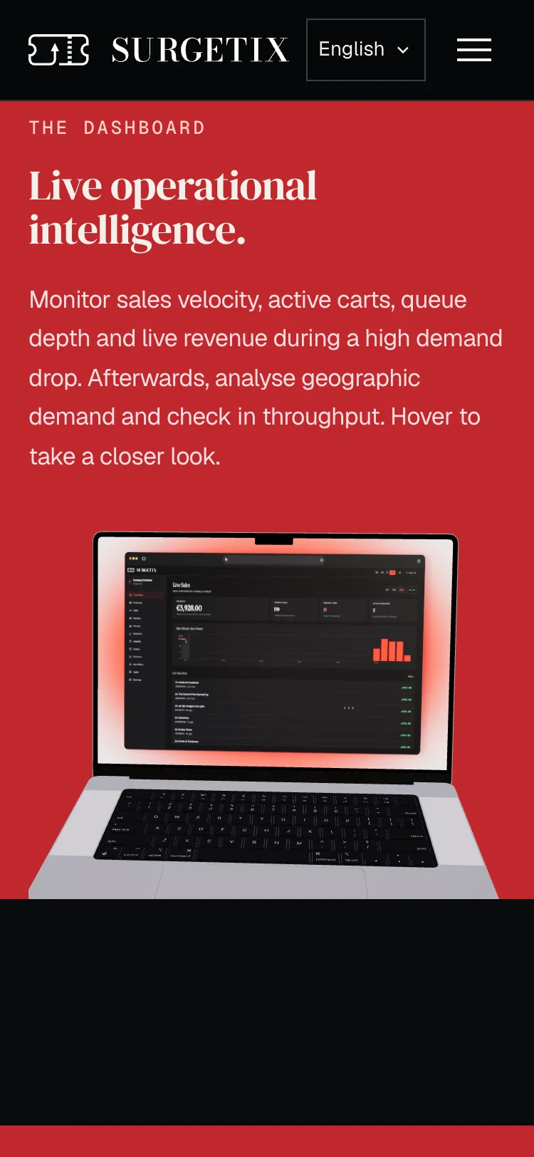
The dashboard section at phone width: the label, the headline over two lines, the text, and the laptop with the dashboard on its screen.
The dashboard, phone, 375 wide

Pricing

Pricing that fits your festival.

Pricing as the brand’s ticket motif: a cream card split by a perforation into two halves, the copy on one and four points on the stub. The client asked for a button in the section, so it has its own: See how pricing works.
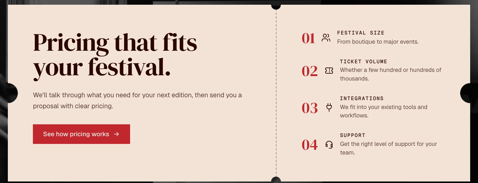
A cream ticket shaped card with round notches and a dashed perforation down the middle: on the left the serif headline Pricing that fits your festival, a line of text and a red button See how pricing works; on the right four numbered points in red, Festival size, Ticket volume, Integrations and Support, each with a small icon and one line.
Pricing, Home page. The ticket card, cropped from the section

FAQ

Questions

The common questions as an accordion on a light cream ground; an open row breaks out to a full bleed band. Hover states that are fun but pretty: closed rows darken, the open row turns red.
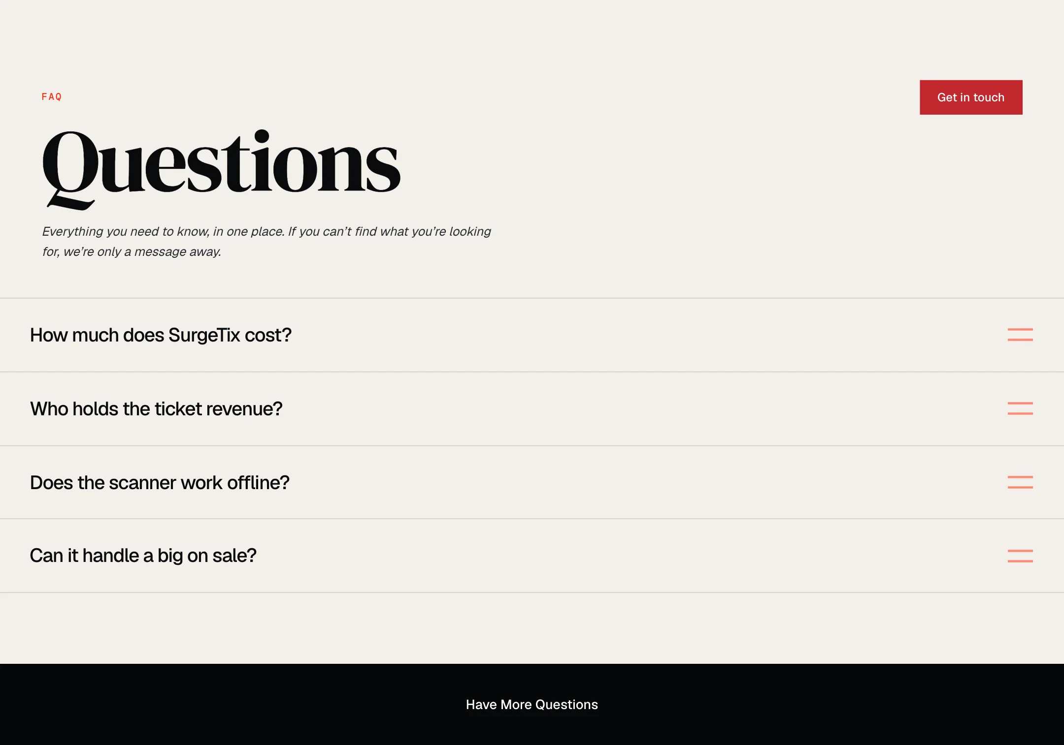
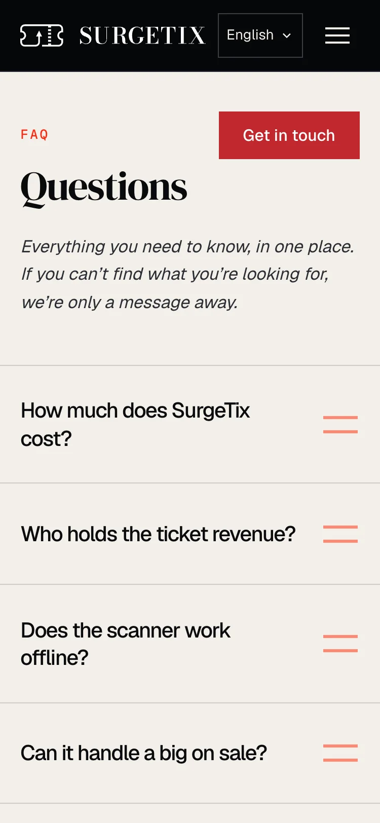
A light cream section: the small red label FAQ, a red Get in touch button at the right, the heading Questions in a large black serif, a line in italics, and four questions in rows with a coral mark at the right of each, above a black band that reads Have More Questions.
FAQ, Home page, 1440 wide
The questions at phone width: the label, the red button, the heading, the line in italics and the four questions in rows.
FAQ, phone, 375 wide

Contact

Let’s make this easy to evaluate.

One contact section, on every page directly above the footer, with the enquiry form in a cream ticket shaped card. It asks about the festival’s biggest friction rather than a pick of products, because SurgeTix sells the whole package.
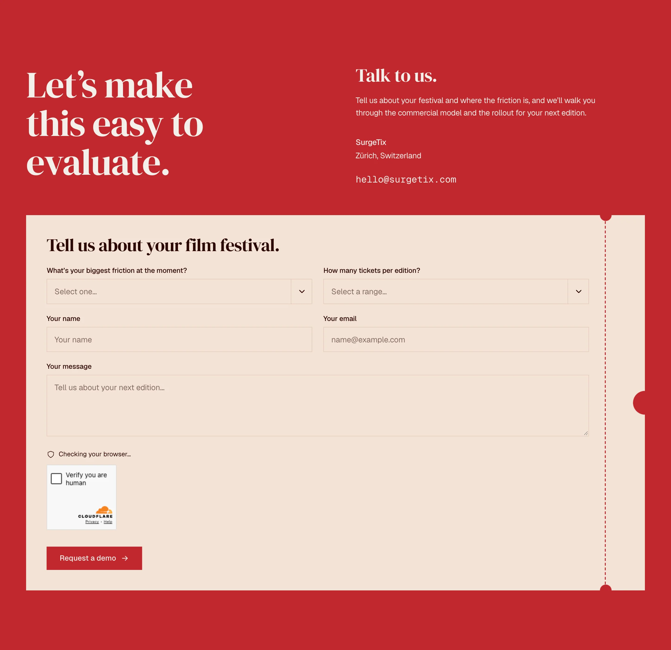
A red section: the serif headline Let’s make this easy to evaluate on the left, Talk to us with a short text, the place Zürich, Switzerland and an email address on the right, and below a cream ticket shaped card with a dashed perforation holding a form titled Tell us about your film festival: two dropdowns, name, email, a message field, a browser check and a red Request a demo button.
Contact, Home page, 1440 wide

Shipped. The site is live at surgetix.com

The full process

Concept stage boards, 9 September 2026, and two boards from the design file. Logo and palette were changed after the client review of 17 September 2026 (decisions log).
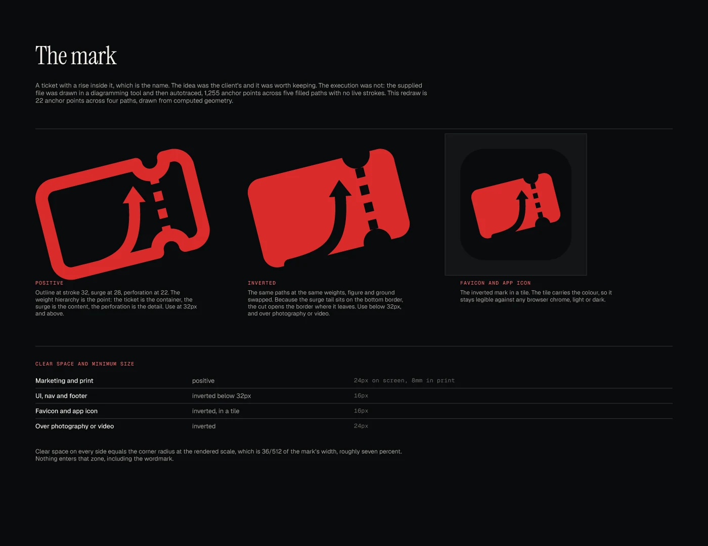
A dark board titled The mark: a red ticket drawn as an outline with a rising arrow inside, tilted, beside a filled version and an app icon, with notes on stroke weights and a table of clear space and smallest sizes.
The mark, Brand kit, Board 1. Concept stage
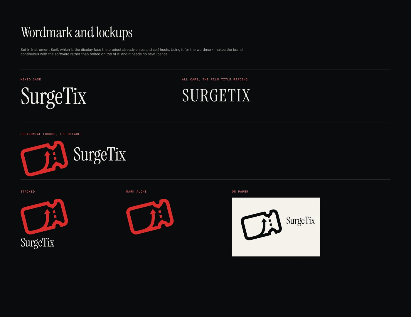
A dark board titled Wordmark and lockups: the name set as SurgeTix and as SURGETIX in a serif face, a horizontal lockup with the red ticket, a stacked lockup, the mark alone, and a version in black on a paper panel.
Wordmark and lockups, Brand kit, Board 2. Concept stage
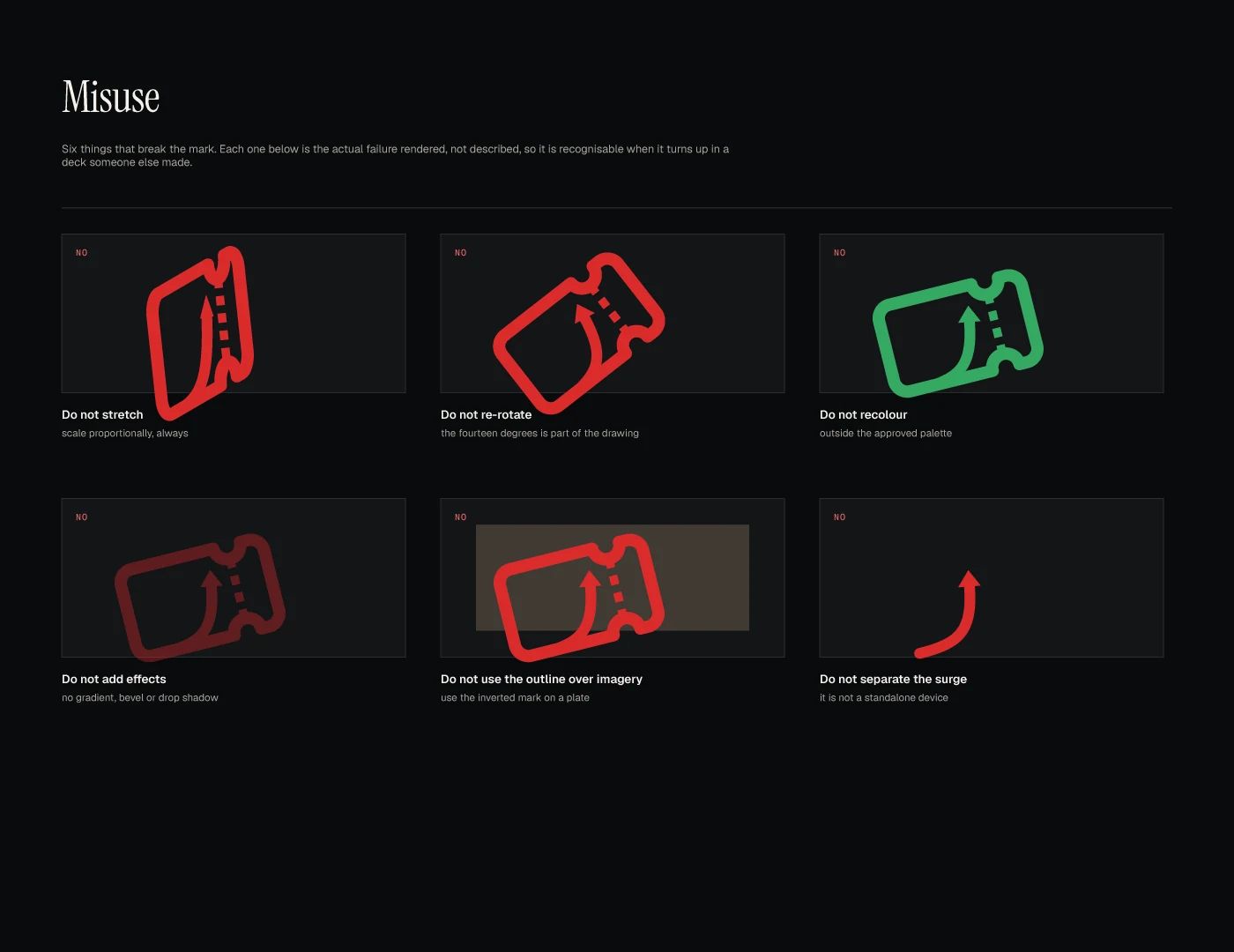
A dark board titled Misuse with six small panels, each marked No: the mark stretched, turned, recoloured green, with a shadow, placed as an outline over a picture, and the arrow alone.
Misuse, Brand kit, Board 5. Concept stage
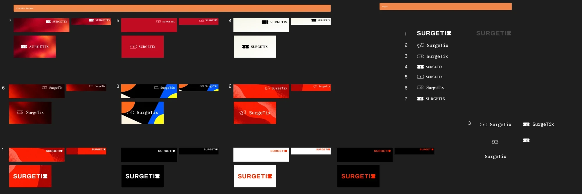
A wide dark board from the design file. At the right a numbered list of seven logo options: the name in heavy capitals with a ticket shape as the last letter, in a monospaced face with an outline ticket, in serif capitals with a filled ticket, in serif capitals with an outline ticket, and in a mixed case serif. At the left each option as banners in red, black, white and cream.
Logo options, Figma file, Board with seven numbered options
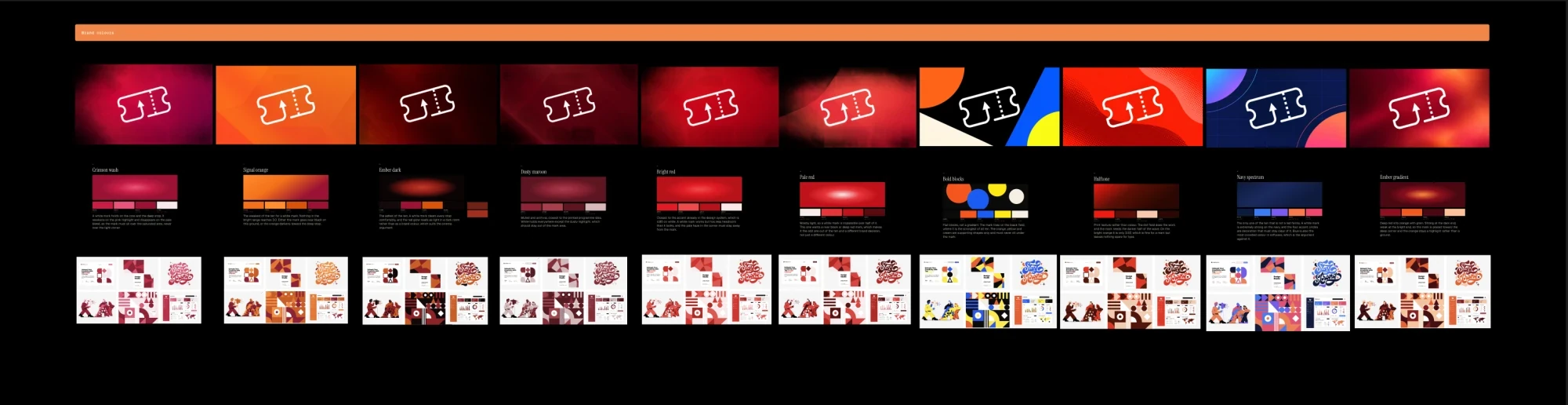
A wide dark board from the design file: ten colour directions in a row, each a ground with the outline ticket in white, a small palette with a name and a note, and a small sheet of sample graphics below. The grounds run from crimson and orange through dark reds to a block pattern in orange, blue and yellow, a red halftone and a navy.
Colour directions, Figma file, Board with ten directions

Home page

About

Engineered in Zürich.

The opening of the about section: the heading in large display type over one sentence on the team behind SurgeTix.

On a near black ground the small red label About, the heading Engineered in Zürich in a very large serif, and one sentence below it.
About, Home page. The heading only

Other pages

Features

Everything a festival runs on.

The full list of eleven capabilities, each with its statement and text on the left and its live Rive animation on the right.
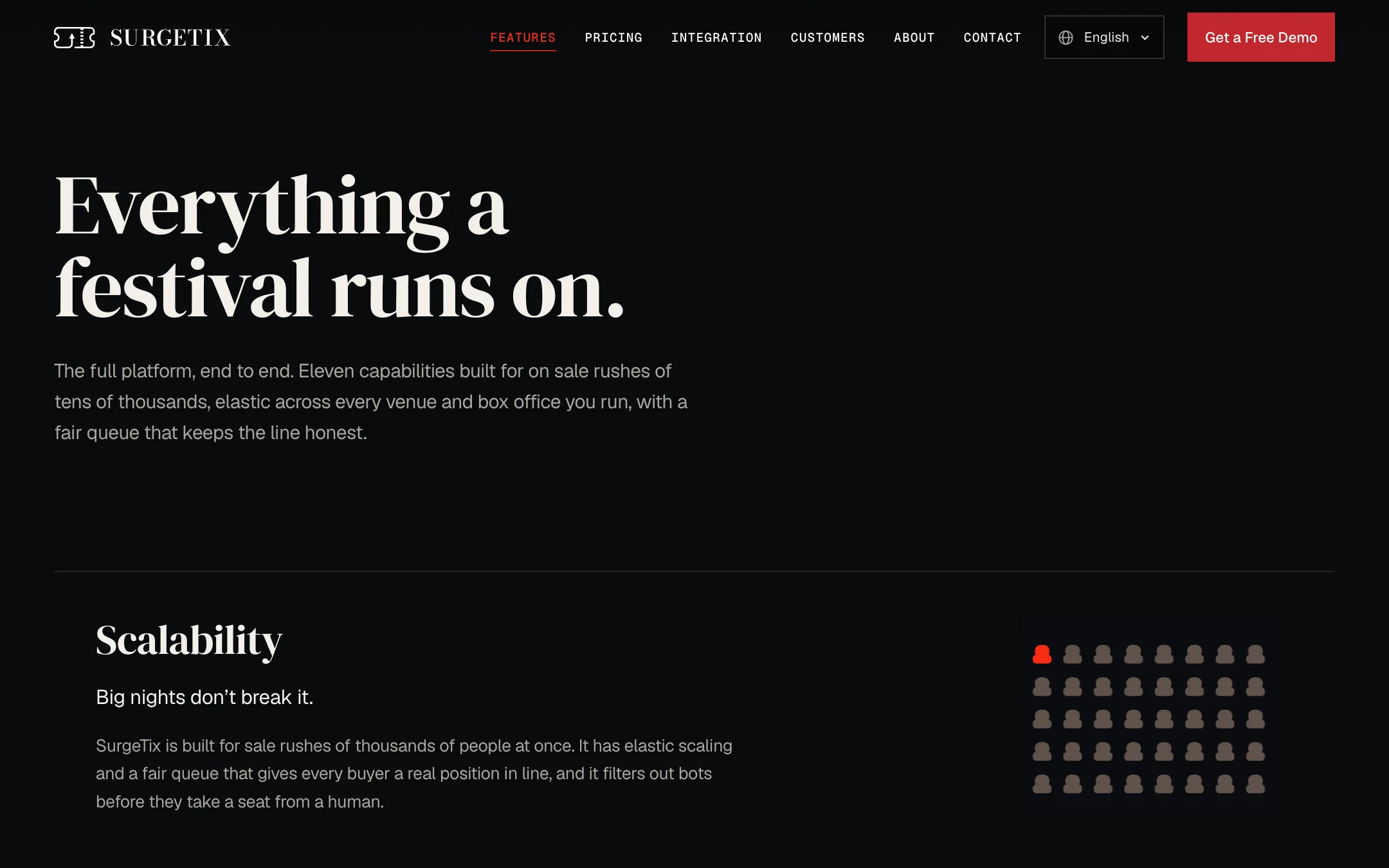
The top of the features page on a near black ground: the navigation with Features marked in red, the serif headline Everything a festival runs on, a short text, and the first capability, Scalability, with a statement and a paragraph on the left and a grid of small seat shapes, some red, on the right.
Features page, 1440 wide

Integration

Your website. Your design. Our ticketing underneath.

The page for the customer facing webshop, in the festival’s colours on its own domain: SurgeTix builds and hosts it, or drops the whole sales flow into the site the festival already runs.
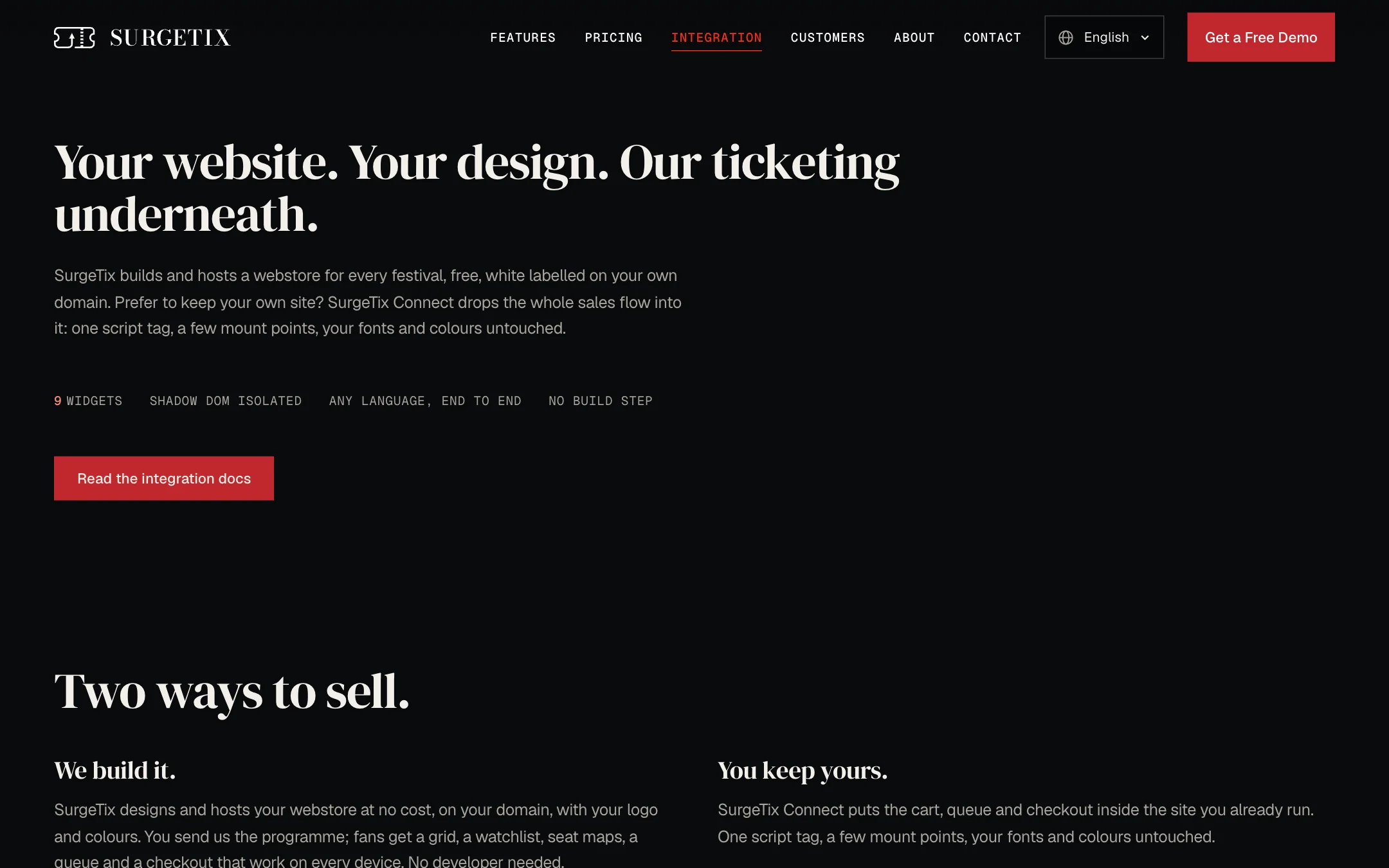
The top of the integration page on a near black ground: the navigation with Integration marked in red, the serif headline Your website. Your design. Our ticketing underneath., a short text, a row of four small capitals labels, a red button Read the integration docs, and below the heading Two ways to sell with two columns, We build it and You keep yours.
Integration page, 1440 wide

Early direction: six of the art directions built as prototypes, September 2026.

Visit websitesurgetix.com