Mimic Robotics
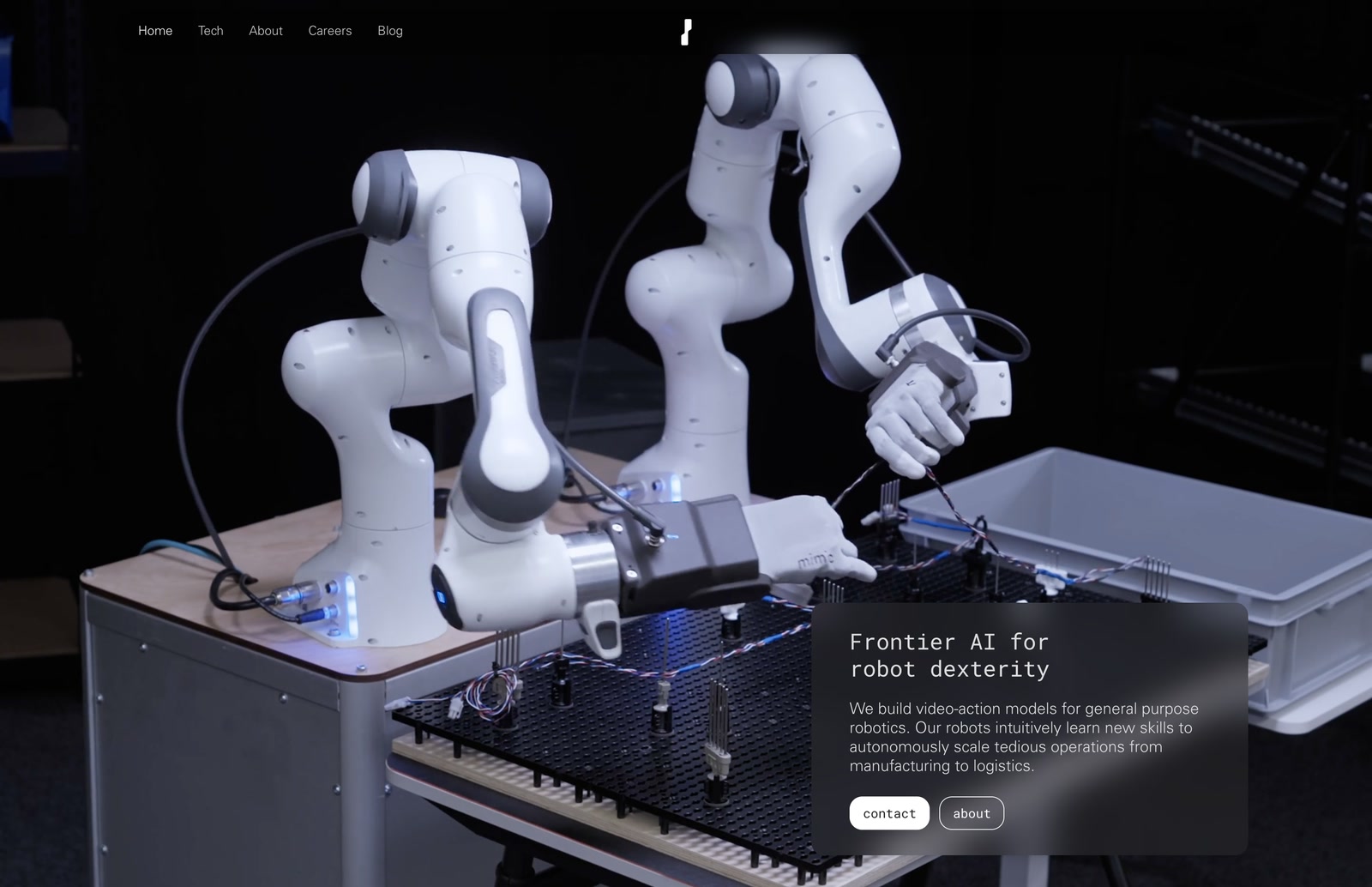
Mimic Robotics is a physical AI company building dexterous robotic hands that learn new skills and take on complex manual work, from manufacturing to logistics.
The project included full brand development, a component-driven UI kit, and an early-stage digital presence concept, as well as building out the website.
- Project Type
- Web DesignUX & UI DesignBrand GuidelinesVisual Guidelines
- Skills
- Visual Identity DesignDesign System SetupInteraction DesignArt DirectionInterface MockupsBrand Documentation
- Client
- Mimic Robotics AG
- My Role
- UI & UX DesignWeb DevelopmentBranding DesignGraphic Design
Short read
My Role
For Mimic Robotics, I was responsible for developing a visual identity and web presence that reflected the company’s cutting-edge robotics technology. My role included UI/UX design, branding, and full website development. The website was designed to communicate Mimic’s mission clearly to partners, investors, and engineers, combining visual clarity with technical credibility.
Target audience
Mimic’s audience includes robotics researchers, deep-tech investors, industrial partners, and future-focused manufacturers. The brand and website needed to inspire confidence, showcase technical innovation, and appeal to collaborators aligned with Mimic’s mission to redefine robotic autonomy in physical environments.
Main Challenge
The main challenge was designing a digital and visual identity that translated Mimic’s deep-tech robotics innovation into a brand that felt approachable, trustworthy, and forward-thinking. The project required balancing bold visual expression with high usability.
We analyzed the landscape of robotics startups, identifying a gap in how early-stage robotics companies communicate complex technology. Most lacked clarity, personality, and consistent UX.
This insight shaped our direction: Mimic needed a distinct, confident brand and a website that could simplify without oversimplifying, establishing trust while highlighting innovation.
Visual Identity
The Mimic Robotics identity combines clean modular design with bold, utilitarian aesthetics.
Information Architecture
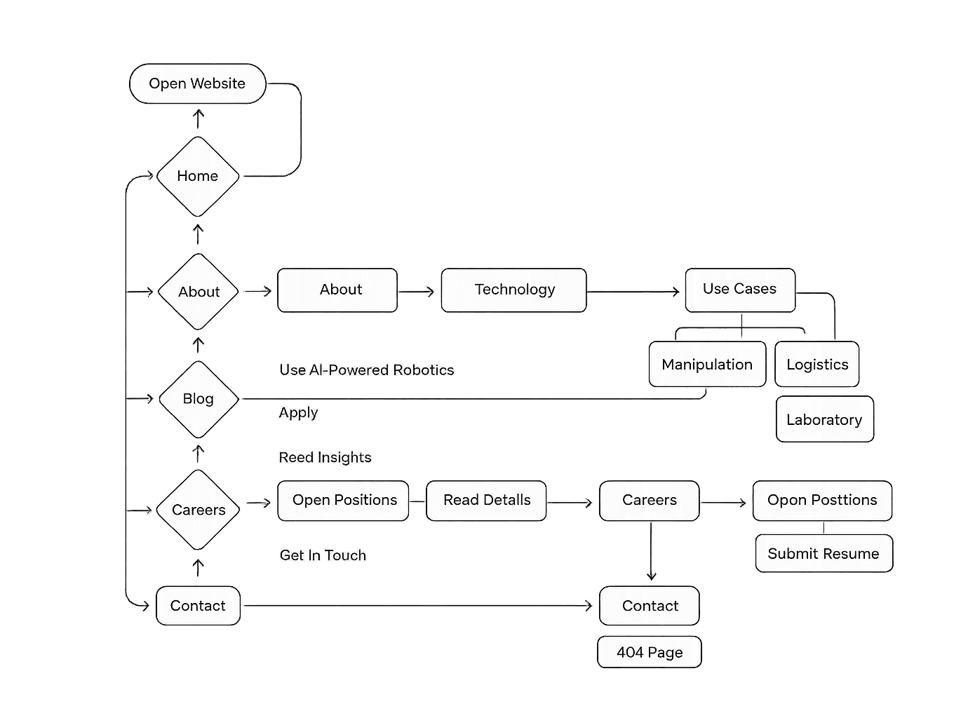
The architecture emphasizes clarity, depth, and modular structure. Visitors are guided through Mimic’s mission, robotics technology, and product ecosystem via structured navigation and interactive touchpoints.
Picture rendering screens
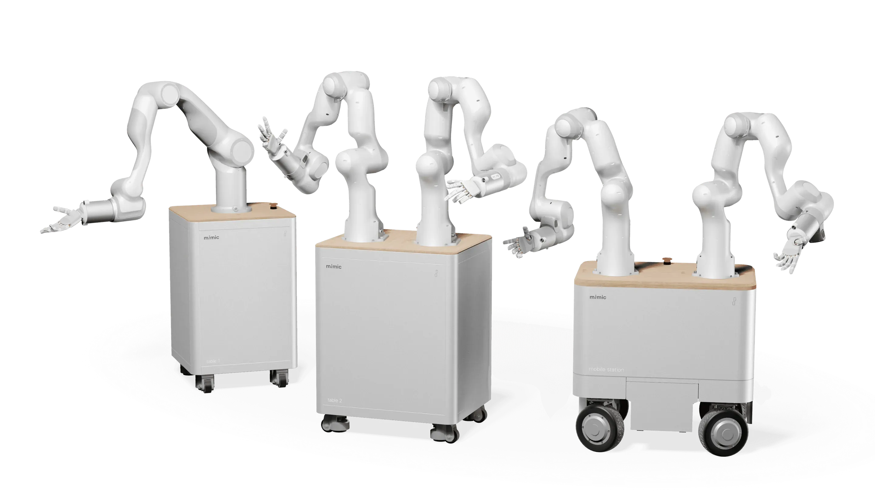
The rendering style is soft, realistic, and minimal. It highlights form and function with neutral tones, diffused lighting, and subtle textures. Materials are shown accurately to convey quality and approachability, reflecting Mimic’s precise yet human-centered design.
System Design
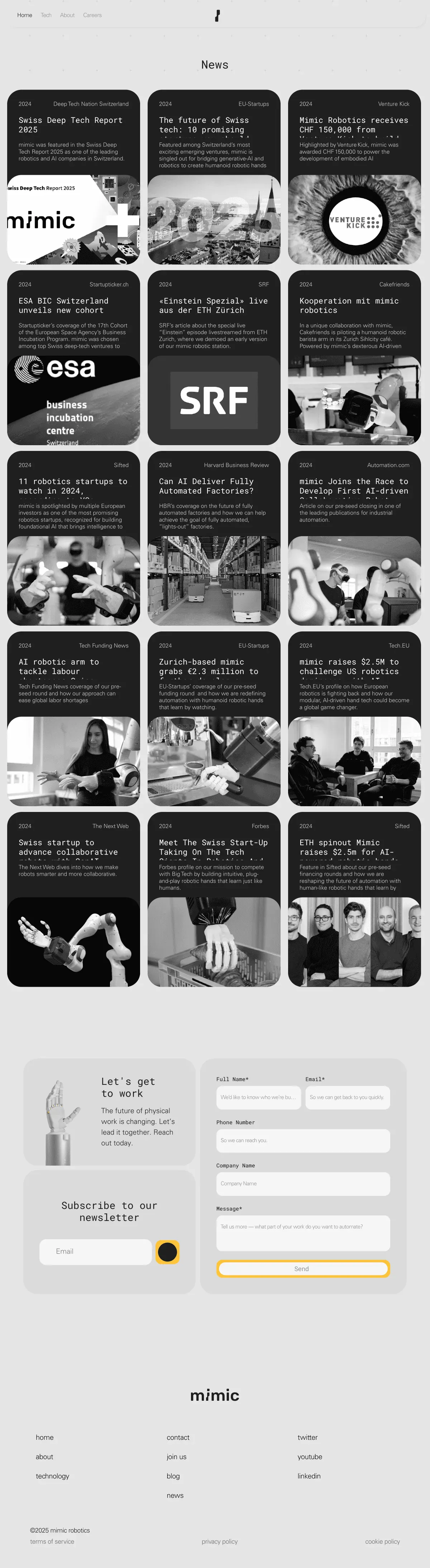
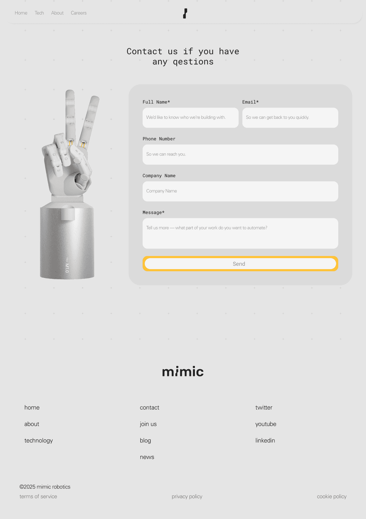
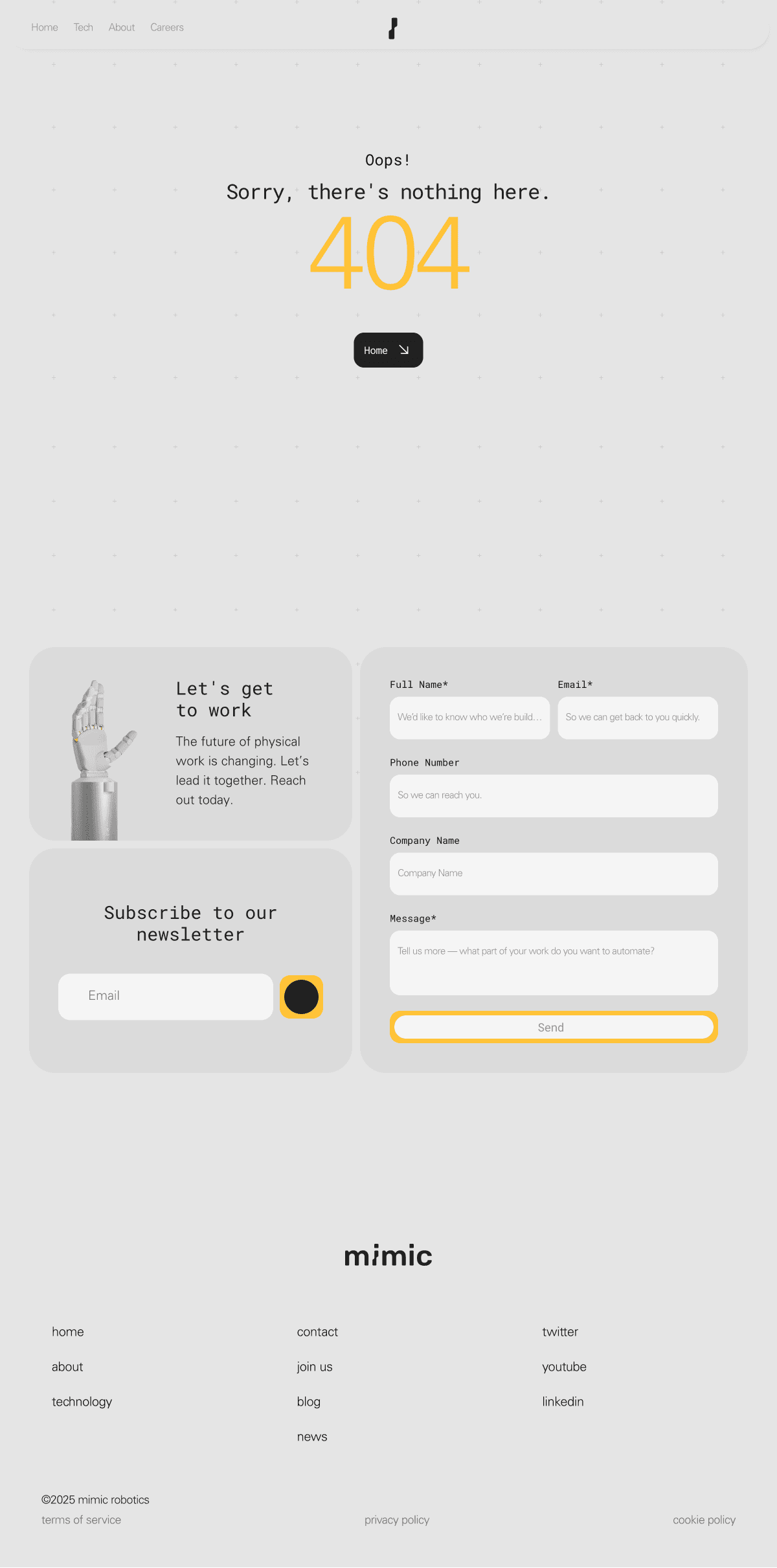
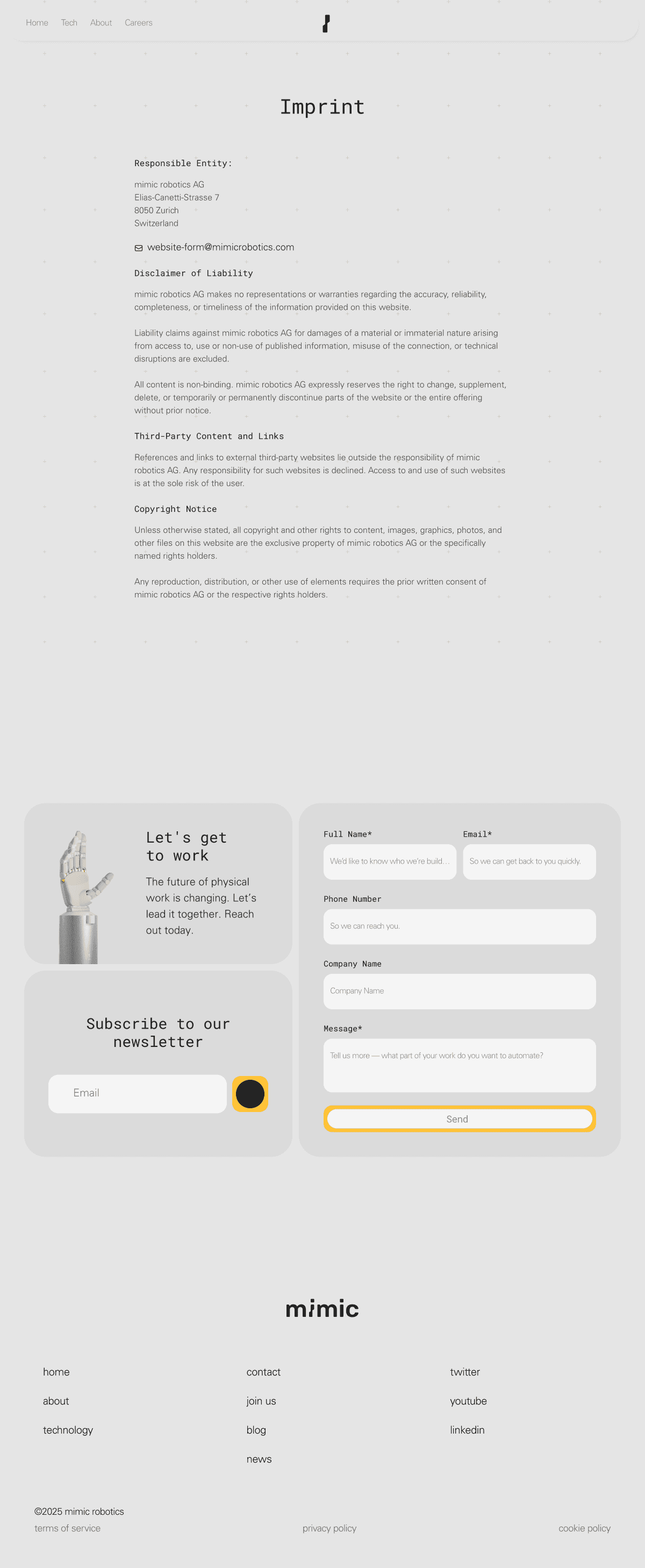
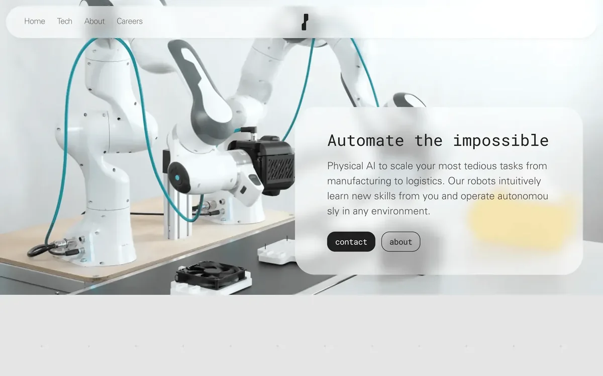
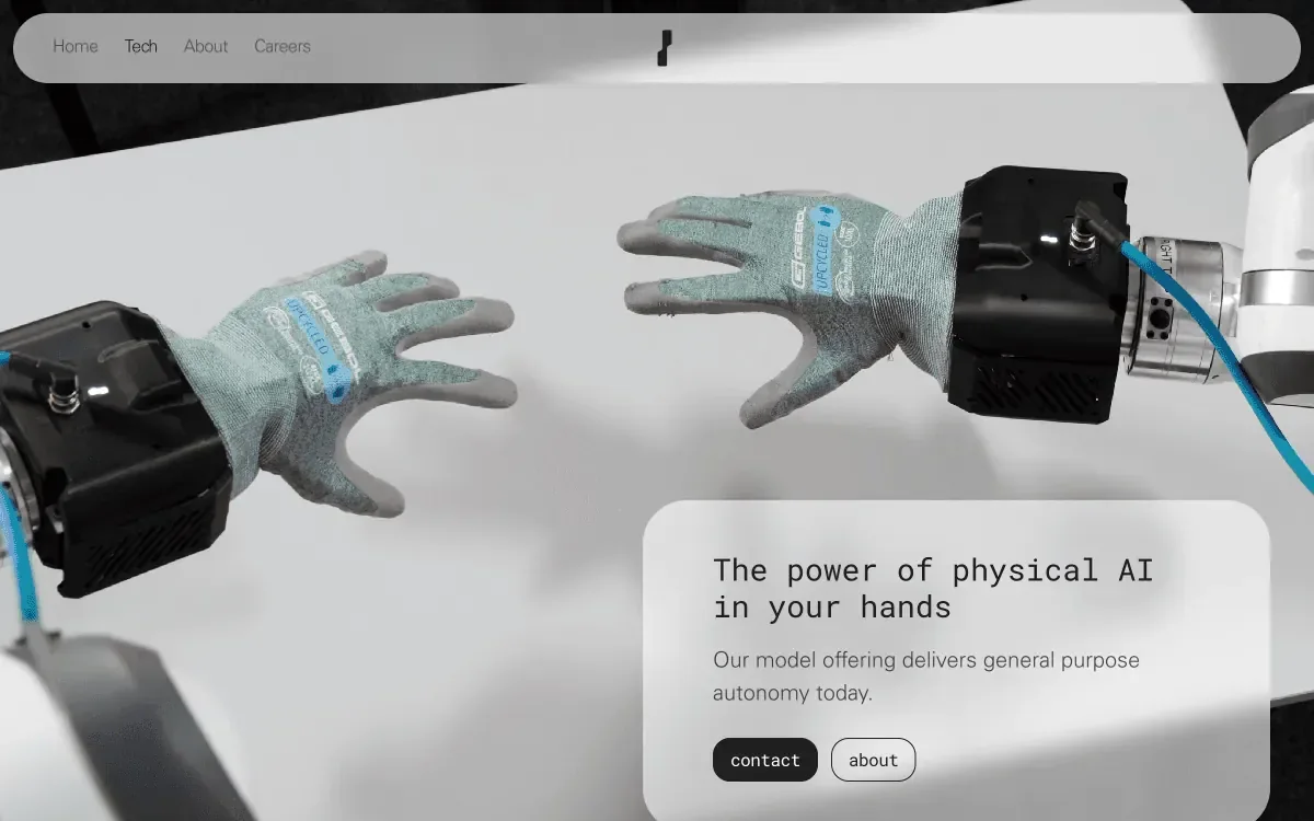
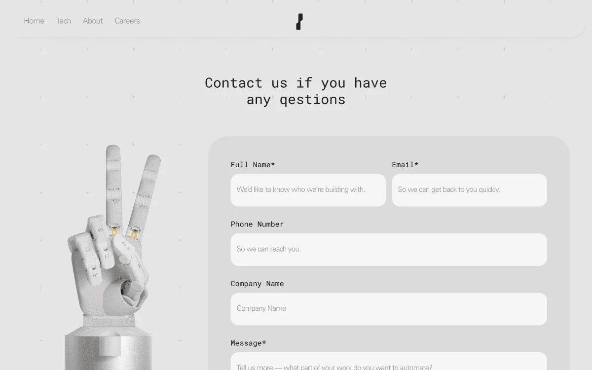
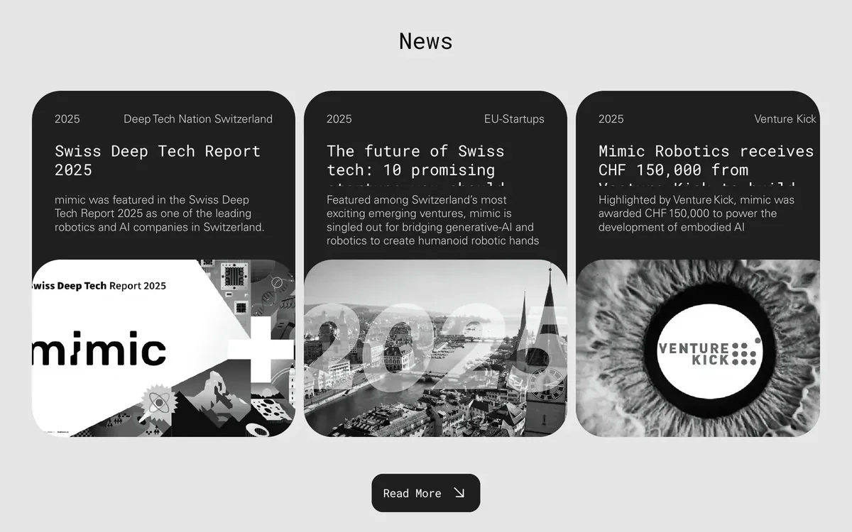
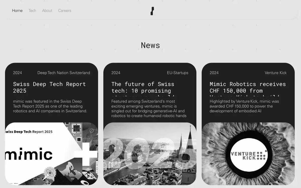
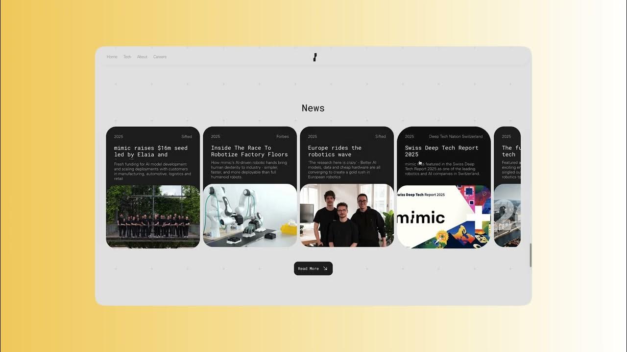
The website turns deep-tech research into a clear story. Structured navigation leads visitors from Mimic’s mission to its technology and use cases, so investors, partners and engineers each find what they need quickly.
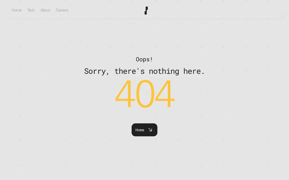
Step 1 / 6 Home
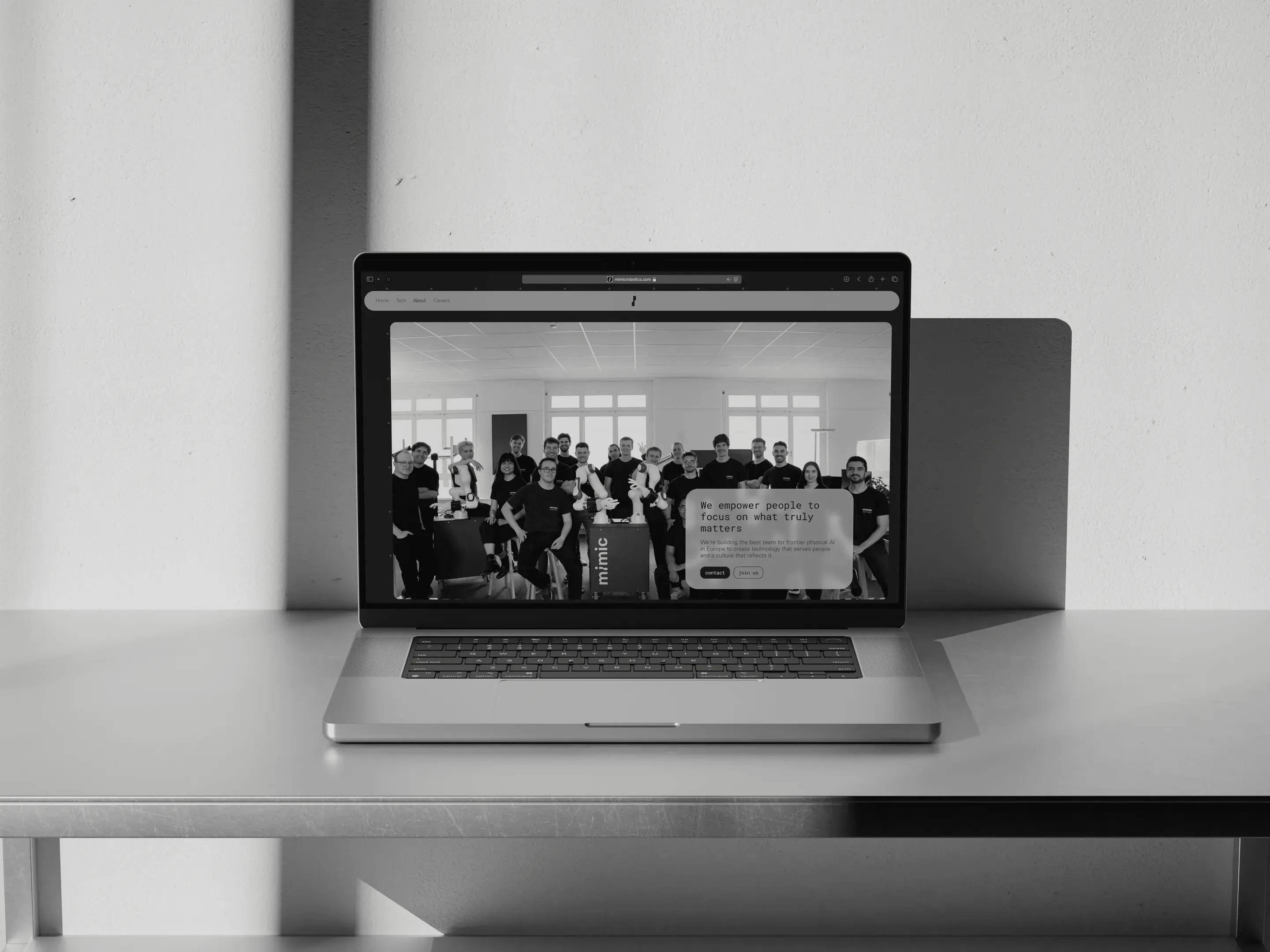
The result is a crisp, future-facing brand language built for real-world interaction and digital clarity.
The full process
Mimic Robotics is a physical AI company building dexterous robotic hands that learn new skills and take on complex manual work, from manufacturing to logistics. Inspired by modular design systems and expressive hardware aesthetics, the visual identity blends bold simplicity with a tech-forward edge. The project included full brand development, a component-driven UI kit, and an early-stage digital presence concept, as well as building out the website.
- Project Type
- Web DesignUX & UI DesignBrand GuidelinesVisual Guidelines
- Skills
- Visual Identity DesignDesign System SetupInteraction DesignArt DirectionInterface MockupsBrand Documentation
- Client
- Mimic Robotics AG
My Role
- UI & UX Design
- Web Development
- Branding Design
- Graphic Design
For Mimic Robotics, I was responsible for developing a visual identity and web presence that reflected the company’s cutting-edge robotics technology. My role included UI/UX design, branding, and full website development. I created a modular, future-facing identity system inspired by physical computing and robotic forms. The website was designed to communicate Mimic’s mission clearly to partners, investors, and engineers, combining visual clarity with technical credibility.
Main Challenge
The main challenge was designing a digital and visual identity that translated Mimic’s deep-tech robotics innovation into a brand that felt approachable, trustworthy, and forward-thinking. The project required balancing bold visual expression with high usability. Building the design system from scratch, I focused on creating clarity in communication while reflecting Mimic’s focus on adaptability, autonomy, and precision through interaction design and layout structure.
Target audience
Mimic’s audience includes robotics researchers, deep-tech investors, industrial partners, and future-focused manufacturers. These are stakeholders looking for advanced robotic solutions capable of performing dexterous, flexible tasks in real-world settings. The brand and website needed to inspire confidence, showcase technical innovation, and appeal to collaborators aligned with Mimic’s mission to redefine robotic autonomy in physical environments.
Our research for Mimic Robotics focused on understanding how to visually and functionally position a deep-tech robotics company at the intersection of AI, autonomy, and dexterous manipulation. We explored how to translate technical depth into a compelling, accessible digital identity that resonates with both investors and engineers.
Market and Competitive Analysis
We analyzed the landscape of robotics startups, identifying a gap in how early-stage robotics companies communicate complex technology. Most lacked clarity, personality, and consistent UX. This insight shaped our direction: Mimic needed a distinct, confident brand and a website that could simplify without oversimplifying, establishing trust while highlighting innovation.
Client's Needs
Through conversations with the founders and reviewing competitive sites, we uncovered key priorities:
- Clarity of Communication: Translate deep-tech capabilities into simple, digestible visuals and copy
- Investor-Ready UX: Build confidence and interest through strong storytelling and UI
- Visual Differentiation: A look and feel that reflects Mimic’s human-inspired robotics approach
Key Findings
• Simplified Technical Storytelling: Needed to express high-complexity ideas with visual clarity
• Human + Machine Branding: An identity built around the human-inspired hand, precise but approachable.
• Scalable Design System: A modular component system that grows with new products, research releases and pages.
- Information Architecture
- User Flow
- Brand Guidelines
- Visual Identity
The Mimic Robotics identity combines clean modular design with bold, utilitarian aesthetics. Typography is structured and legible, echoing technical precision, while the color palette contrasts vibrant signal yellow with industrial greys and deep black, reflecting both innovation and reliability. The result is a crisp, future-facing brand language built for real-world interaction and digital clarity.
Website User Flow Sketch
Information Architecture
The architecture emphasizes clarity, depth, and modular structure. Visitors are guided through Mimic’s mission, robotics technology, and product ecosystem via structured navigation and interactive touchpoints. Key flows include exploration of modules, research use cases, and hardware-software integration. The experience supports quick access to documentation, applications, and product configurations, making the website both a discovery hub and technical resource.
Teenage engineering
The foundation of Mimic Robotics draws inspiration from the expressive minimalism of Teenage Engineering: prioritizing tactile interaction, playful modularity, and clean, intentional design. Mimic’s hardware and digital system are built to empower users to prototype, reconfigure, and explore robotics through an open, accessible platform. Every component is designed for clarity, encouraging hands-on experimentation while maintaining a refined aesthetic that resonates across educational, creative, and technical audiences.
Moodboard
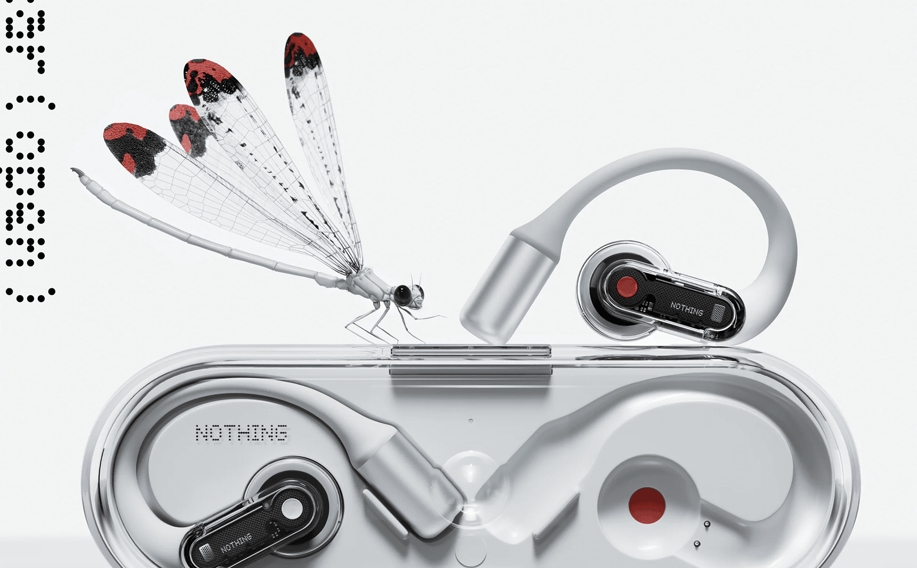
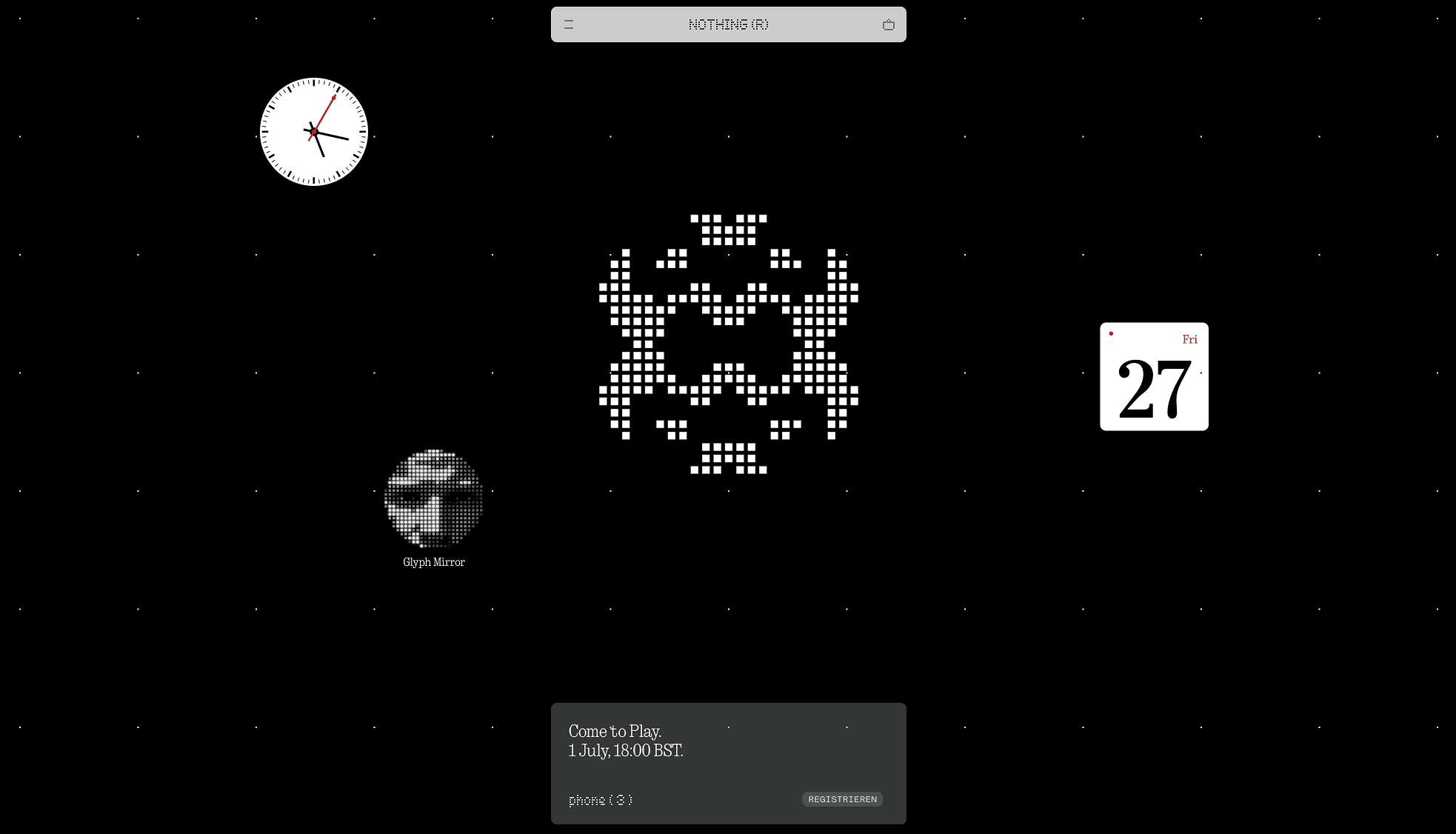
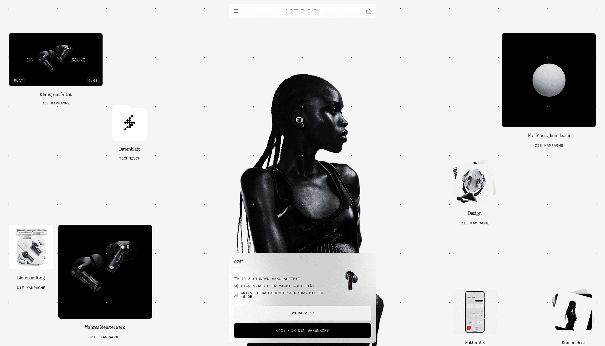
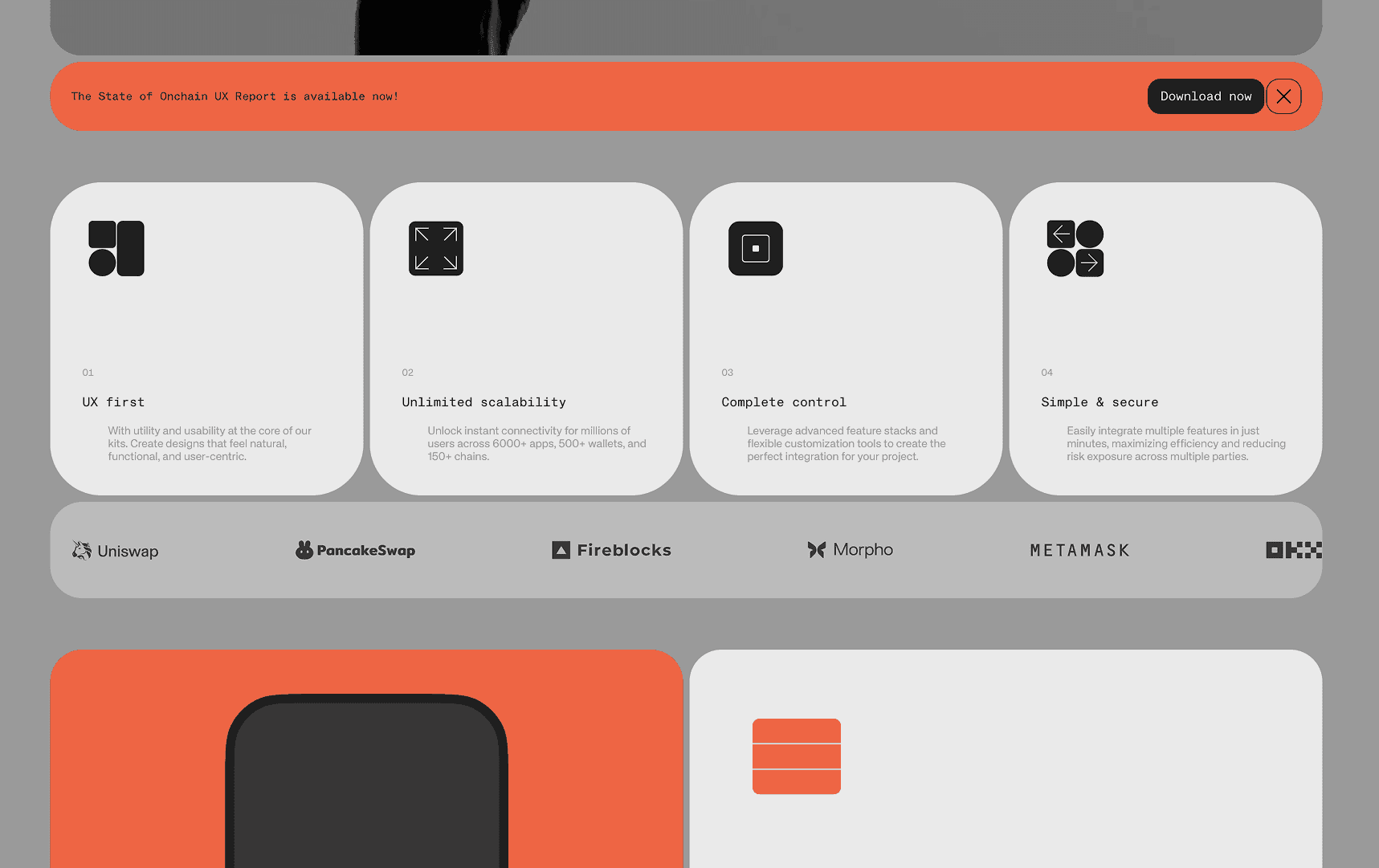
The visual identity of Mimic Robotics draws inspiration from the sleek, modular language of Teenage Engineering and the tactile clarity of high-end industrial design. The moodboard explores a clean, futuristic aesthetic, merging mechanical precision with playful interaction. Color accents, stark contrasts, and high-detail renderings bring energy to minimal layouts, while rounded forms and interface clarity evoke a sense of intuitive functionality. Every reference reinforces a product experience that feels both expressive and engineered, designed for creators, not consumers.
- Logo
- Icon
- Colour Scheme
The Mimic Robotics identity combines clean modular design with bold, utilitarian aesthetics. Typography is structured and legible, echoing technical precision, while the color palette contrasts vibrant signal yellow with industrial greys and deep black, reflecting both innovation and reliability. The result is a crisp, future-facing brand language built for real-world interaction and digital clarity.
Icons
The iconography is minimal, technical, and purpose-driven. Line-based, monochrome symbols reflect core themes of innovation, automation, and precision, while maintaining a bold, recognizable visual language. Each icon is designed for clarity and scalability across both hardware and digital applications, reinforcing the brand’s futuristic yet functional identity.
Picture rendering screens
The rendering style is soft, realistic, and minimal. It highlights form and function with neutral tones, diffused lighting, and subtle textures. Materials are shown accurately to convey quality and approachability, reflecting Mimic’s precise yet human-centered design.
System Design
The website turns deep-tech research into a clear story. Structured navigation leads visitors from Mimic’s mission to its technology and use cases, so investors, partners and engineers each find what they need quickly.
Wireframes
The wireframe assisted us in incorporating the interface into the design.