Cookify
Cookify is a food scanning recipe app that scans your kitchen to generate recipes based on selected ingredients.
It offers step-by-step guidance for preparing and cooking dishes, enhancing culinary exploration.
- Project Type
- Food FuturesEnd-to-end ServiceProduct DesignUX/UI
- Skills
- Visual Identity DesignDesign LibraryInformation ArchitectureUsability TestingUser Interface DesignPrototypingProject Management
- Mentors
- Sandra Kaufmann
- Collaboration
- ZHdK University
- Duration
- 2 weeks
- My Role
- Product ResearchConcept DevelopmentUI & UX DesignIdeating DesignPrototypingBranding DesignProject Management
Short read
My Role
The design process focused on a user-centered approach, involving comprehensive user research, defining personas, creating wireframes and high-fidelity prototypes, and conducting usability testing to ensure a seamless and engaging user experience.
Users
Our users are busy, health-conscious individuals seeking convenience. They want a tool that simplifies meal planning with ingredients on hand, offering personalized, easy-to-follow recipes to enhance their cooking experience.
Main Challenge
Cookify’s challenge was to design an intuitive app that caters to home cooks of all levels, offering recipes based on available ingredients and accommodating dietary needs. The app needed to balance simplicity with a comprehensive feature set, including an easy-to-use fridge and pantry scanning feature for a seamless user experience.
By conducting over 20 interviews with a diverse range of users, from busy professionals to hobbyist cooks, we uncovered a demand for simplified meal planning that adapts to dietary restrictions and available ingredients.
- Need for easy-to-follow, customizable recipes.
- Desire for dietary restriction filters and allergy considerations.
- Preference for minimal food waste through smart pantry management.
Our Solution
Cookify transforms cooking into a creative experience by scanning your kitchen ingredients to generate personalized recipes.
Scan to See What You Can Cook
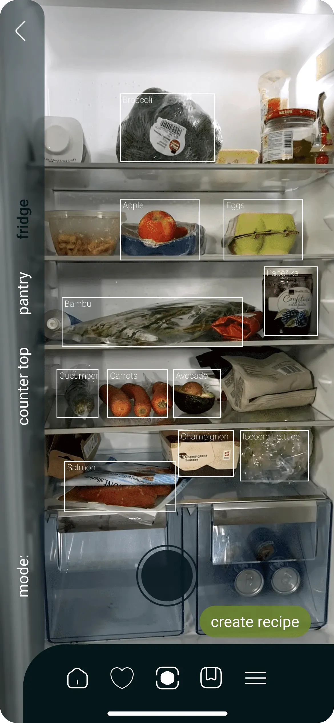
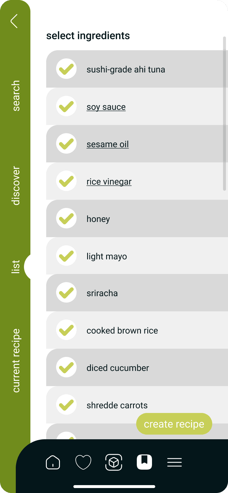
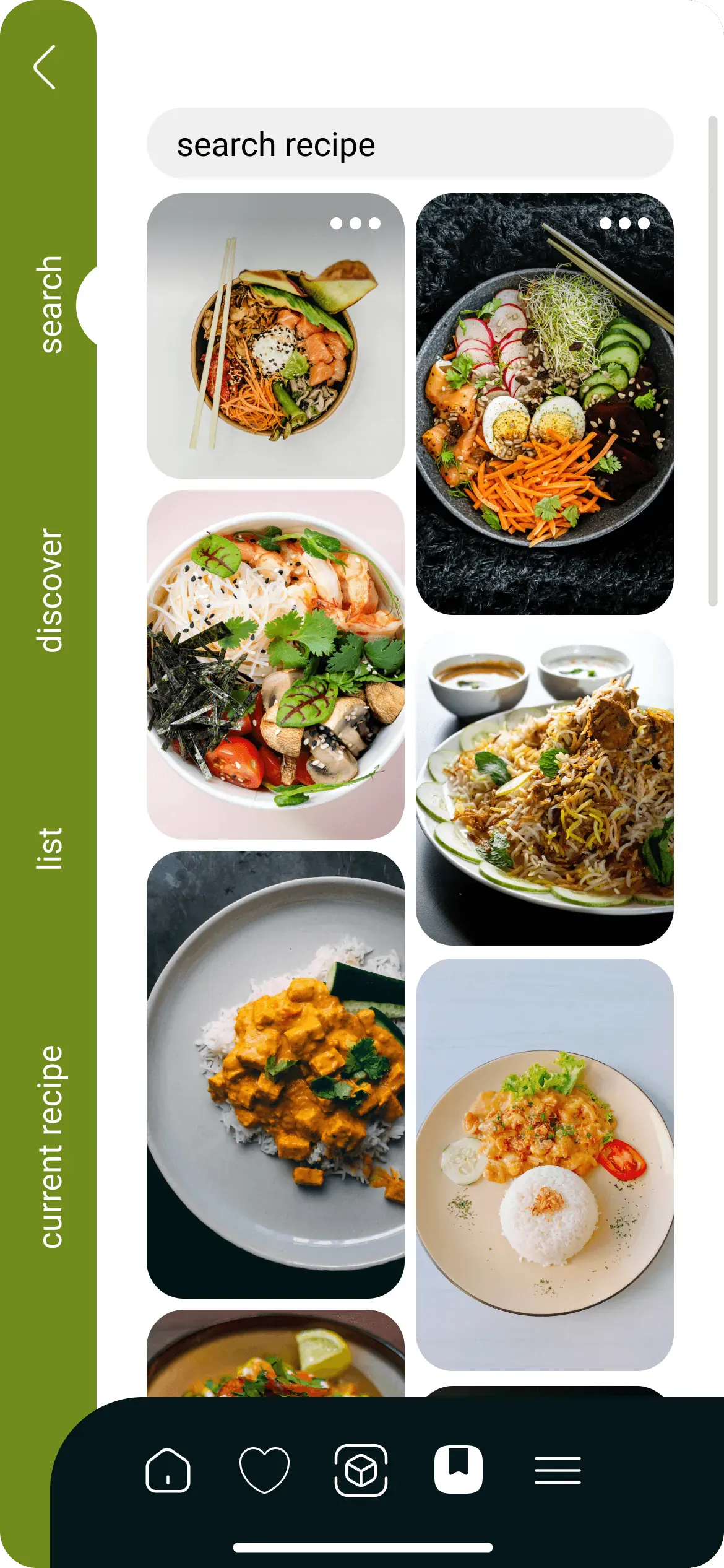
Users can snap pictures of their countertop, pantry, and fridge, enabling AI to identify available ingredients. The generated ingredient list empowers users to choose the items they want to use, and the search tab simplifies finding similar recipes.
Step 1 / 7 Home Screen
Discovery Menu
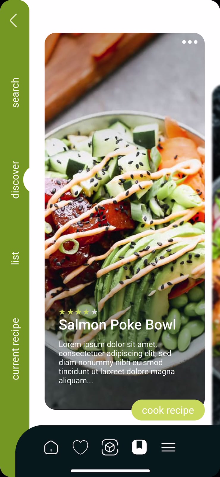
Vertical menu for quick browsing: switch between search, discover, lists, and recipes effortlessly.
Recipe Personalization Logic
Cookify’s recipe personalization intelligently combines user input on ingredients, dietary needs, and cooking skills to generate tailored suggestions.
Assets
The key assets for our application blend minimalist design with vintage and classic elements, using a bold color scheme to enhance both usability and visual appeal.

Spoon Loading
A sleek loading animation that serves as the main logo, adding a playful and engaging touch to the app.
Central Navbar
A streamlined navigation bar that connects users to essential app sections. Its minimalistic design and intuitive icons ensure easy access to home, favorites, recipe creation, and more.

Function of App Illustrations
Upon logging in, users will encounter three screens crafted to guide them through the application's intended functionality.
Branding
The flexible design suits all skill levels, and the branding emphasizes simplicity and efficiency, making it accessible to all.


- #FFFFFF
- #C6D055
- #708C1B
- #041619
Typeface: Roboto
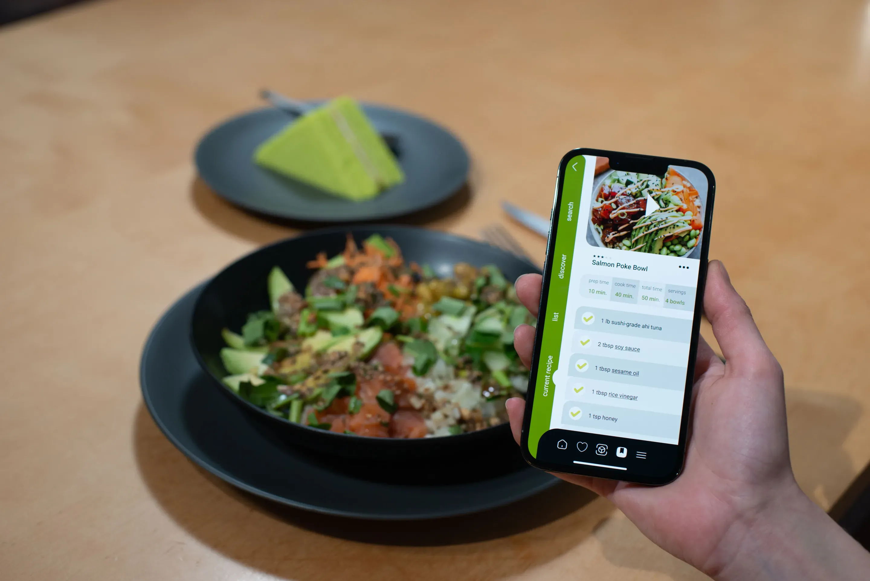
The app’s intuitive interface guides users step-by-step, offering real-time tips and catering to dietary needs, promoting culinary exploration while reducing food waste.
The full process
Cookify is a food scanning recipe app that scans your kitchen to generate recipes based on selected ingredients. It offers step-by-step guidance for preparing and cooking dishes, enhancing culinary exploration.
- Project Type
- Food FuturesEnd-to-end ServiceProduct DesignUX/UI
- Skills
- Visual Identity DesignDesign LibraryInformation ArchitectureUsability TestingUser Interface DesignPrototypingProject Management
- Mentors
- Sandra Kaufmann
- Collaboration
- ZHdK University
- Duration
- 2 weeks
My Role
- Product Research
- Concept Development
- UI & UX Design
- Ideating Design
- Prototyping
- Branding Design
- Project Management
The design process focused on a user-centered approach, involving comprehensive user research, defining personas, creating wireframes and high-fidelity prototypes, and conducting usability testing to ensure a seamless and engaging user experience.
Main Challenge
Cookify’s challenge was to design an intuitive app that caters to home cooks of all levels, offering recipes based on available ingredients and accommodating dietary needs. The app needed to balance simplicity with a comprehensive feature set, including an easy-to-use fridge and pantry scanning feature for a seamless user experience.
Users
Our users are busy, health-conscious individuals seeking convenience. They want a tool that simplifies meal planning with ingredients on hand, offering personalized, easy-to-follow recipes to enhance their cooking experience.
Our Solution
Cookify transforms cooking into a creative experience by scanning your kitchen ingredients to generate personalized recipes. The app’s intuitive interface guides users step-by-step, offering real-time tips and catering to dietary needs, promoting culinary exploration while reducing food waste.

Our research for Cookify combined thorough analysis with practical insights to shape an app that truly resonates with users’ needs and cooking habits.
Market and Competitive Analysis
We analyzed existing meal-planning apps and identified a lack of personalized meal suggestions and inventory tracking. Cookify fills this gap with AI-driven recipe suggestions and ingredient scanning for a more tailored user experience.
Understanding User Needs
By conducting over 20 interviews with a diverse range of users, from busy professionals to hobbyist cooks, we uncovered a demand for simplified meal planning that adapts to dietary restrictions and available ingredients. These insights drove the development of key features, ensuring Cookify meets both novice and seasoned cooks where they are.
Key Findings
• Need for easy-to-follow, customizable recipes.
• Desire for dietary restriction filters and allergy considerations.
• Preference for minimal food waste through smart pantry management.
Defining User Profiles
Persona
We target busy professionals seeking quick, customized recipes using available ingredients, tailored to dietary needs, and easy to fit into tight schedules.

Meghan
- Age
27-year-old
- Occupation
Marketing Specialist
- Location
San Francisco
- Tech Literate
Medium
- Mention
“I’m learning how to cook and do not have much time. I desire an app that creates recipes with what I have at home by simply scanning my fridge and pantry. Also, I have some allergies like lactose intolerance; if the app could show the recipes best suited for me, that would be awesome!”
- Personality
Organized, Tech-Adaptable, Foodie-in-Training, Appreciates Simplicity
- Bio
Meghan is a busy marketing specialist from San Francisco who is eager to learn cooking despite her limited time. She values tools that help simplify her life and is looking for a solution that can accommodate her dietary needs while making cooking easy and efficient.
- Core Needs
Time Efficiency: Needs a quick and simple way to find recipes using ingredients she already has.
Dietary Customization: Desires an app that takes her lactose intolerance and other dietary needs into account.
Learning & Exploration: Wants to explore new cooking techniques and recipes without spending too much time searching.- Frustrations
Limited Time: Finds it challenging to balance her work and personal life, leaving little time for cooking.
Dietary Constraints: Struggles with finding recipes that fit her dietary needs, such as lactose-free options.
Complex Recipes: Dislikes complicated recipes that require ingredients she doesn’t have on hand or doesn’t know how to use.
Field Research and Direct Feedback
We attended food events and conducted workshops to gather real-time feedback and observe cooking challenges firsthand. These experiences allowed us to refine the user interface and features, ensuring Cookify is both practical and delightful to use.
Technology Exploration
To set Cookify apart, we explored AI and AR technologies like those used by Tasty and Whisk for personalized recipes and smart meal planning. Features like AR pantry scanning and AI-driven recipe suggestions enhance user engagement, ensuring Cookify stays ahead of tech trends and user needs.
- Information Architecture
- User Flow
- Recipe Personalization Logic
- Visual Identity
To shape Cookify, we used user insights and prototype testing to create a seamless experience, from scanning ingredients to personalized recipes. The flexible design suits all skill levels, and the branding emphasizes simplicity and efficiency, making it accessible to all.
How does it work?
Find Delicious Recipes with What You Have at Home
Scan to See What You Can Cook
Discover a new recipe tailored to your needs and preferences, using what you already have at home.
Gather Ingedients
Cook Smart with What You’ve Got!
App User Flow Sketch
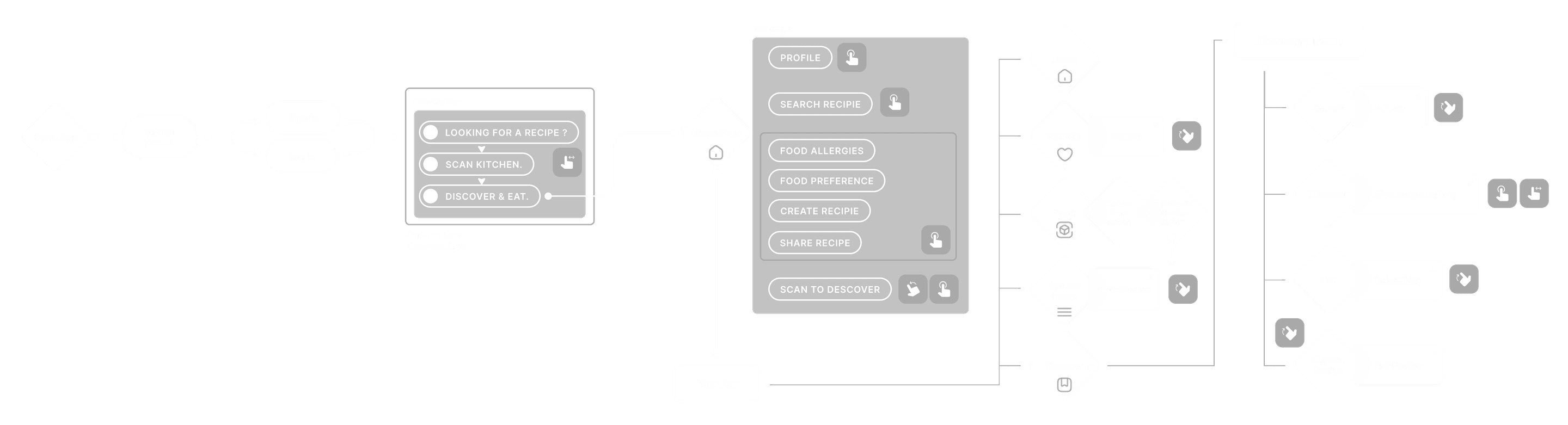
Information Architecture
This illustrates the user journey within Cookify, from scanning ingredients to generating personalized recipes. It starts with clear onboarding steps, guiding users through inputting their available ingredients and dietary preferences.
Recipe Personalization Logic
Cookify’s recipe personalization intelligently combines user input on ingredients, dietary needs, and cooking skills to generate tailored suggestions. It analyzes pantry items, nutritional needs, and flavor profiles to offer practical and exciting meals, promoting exploration and reducing food waste.
Moodboard
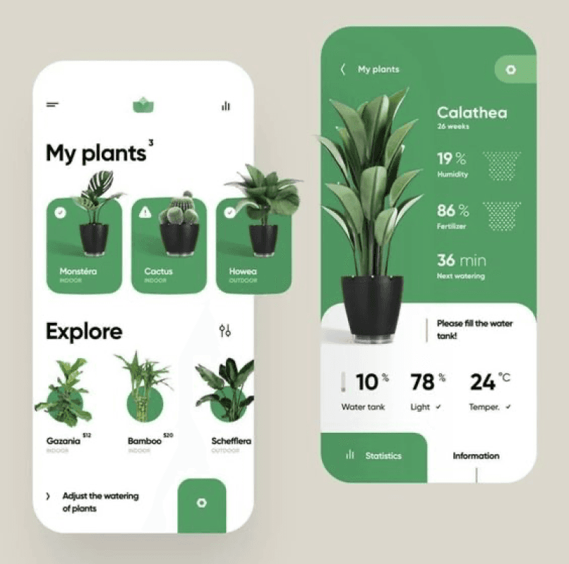
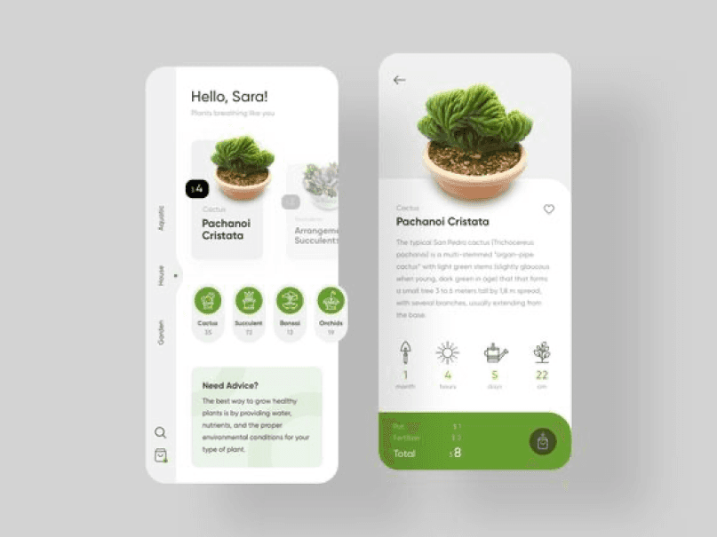
The design emphasizes a clean, modern style with minimalistic elements and soft colors for a calm, engaging user experience. The interface combines sleek typography with inviting visuals, making navigation easy and appealing for all skill levels.



- Logo
- Colour Scheme
Typeface: Roboto
- #FFFFFF
- #C6D055
- #708C1B
- #041619
System Design
The Cookify app design embraces a clean, minimalist style inspired by modern plant care apps and sleek recipe layouts. Using soft color palettes and crisp, sharp typography, it creates a fresh, “tasty” visual experience that feels both inviting and easy to navigate. The design balances simplicity with sophistication, ensuring it looks appetizing and accessible for all users.

Wireframes
The wireframe assisted us in incorporating the interface into the design.





Assets
The key assets for our application blend minimalist design with vintage and classic elements, using a bold color scheme to enhance both usability and visual appeal.
Discovery Menu
Vertical menu for quick browsing: switch between search, discover, lists, and recipes effortlessly.
Home Navigation
Quick-access icons for sharing, creating, and personalizing recipes.



Favourite
Feature allows users to save & access their preferred recipes quickly.
Spoon Loading
A sleek loading animation that serves as the main logo, adding a playful and engaging touch to the app.
Central Navbar
A streamlined navigation bar that connects users to essential app sections. Its minimalistic design and intuitive icons ensure easy access to home, favorites, recipe creation, and more.
Function of App Illustrations
Upon logging in, users will encounter three screens crafted to guide them through the application's intended functionality.


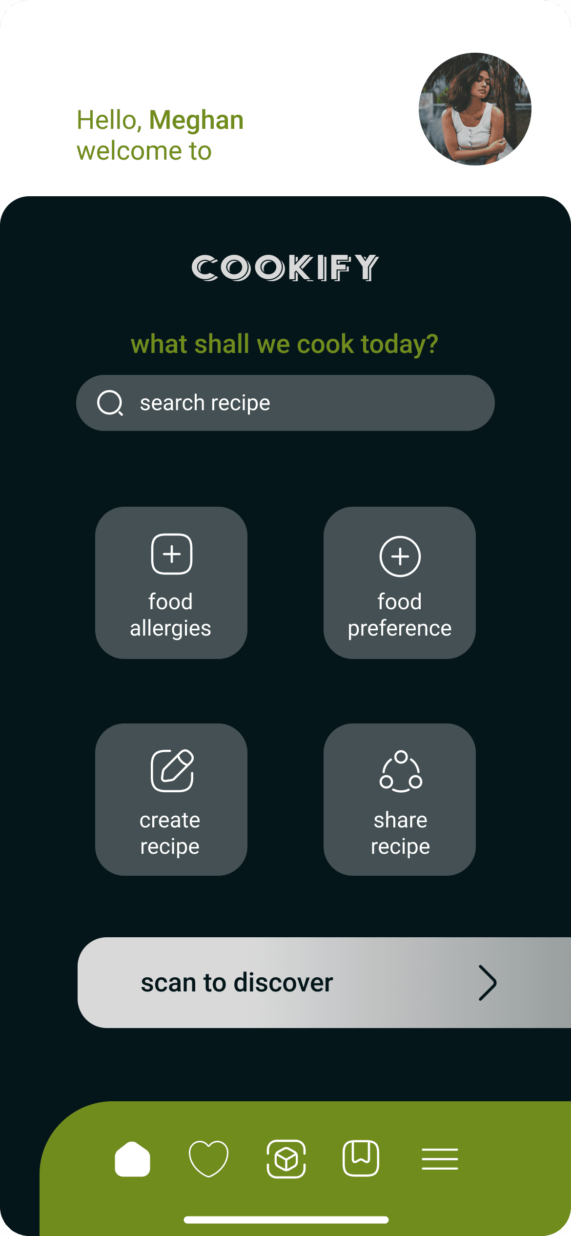
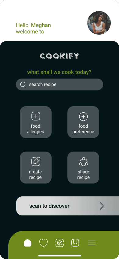
Home Screen
Start your journey by exploring recipes, setting preferences, or creating and sharing your own dishes. Navigate easily and discover personalized cooking options right from the main screen.
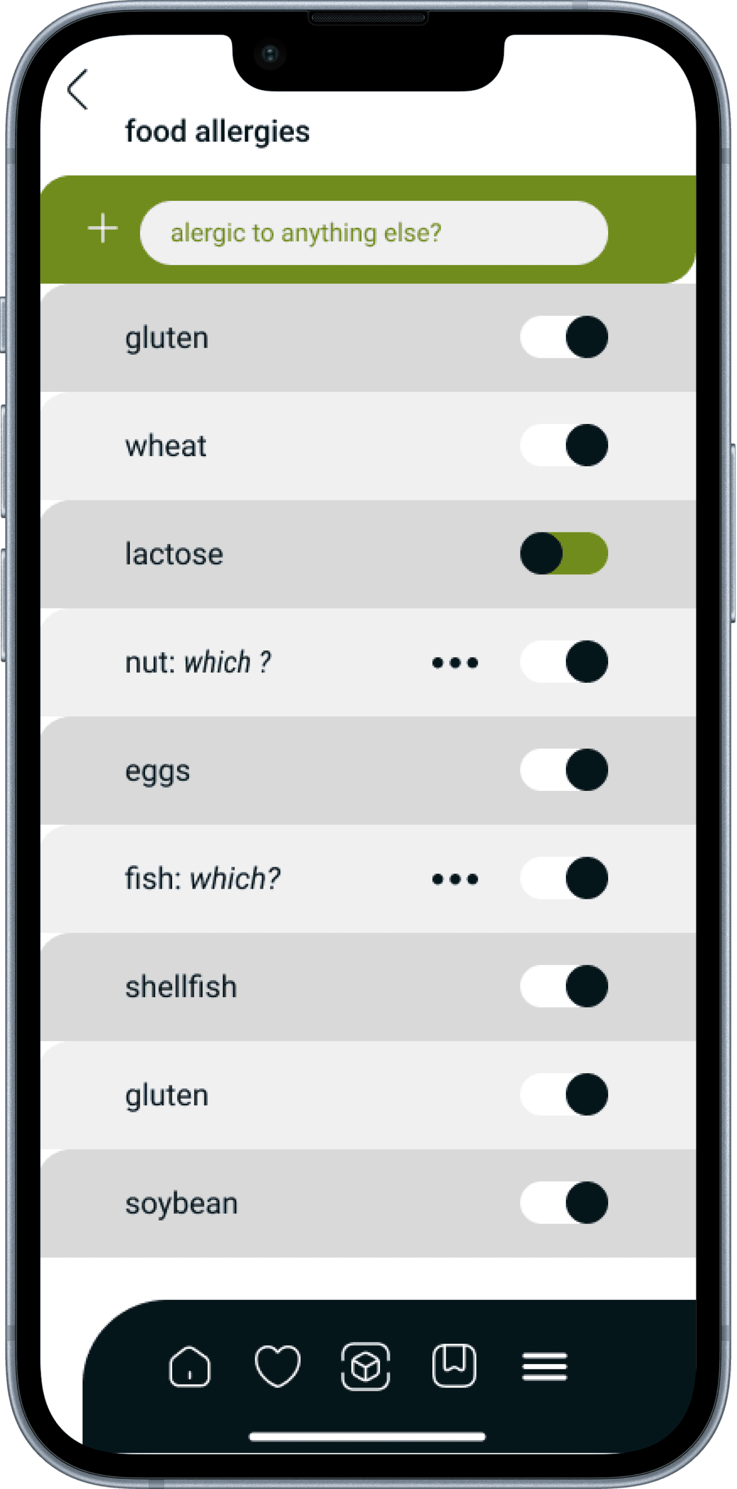
The Food Allergies page, located in the home menu, offers a curated selection of recipes tailored to individual user preferences.
Users can capture images of their countertop, pantry, and fridge; an AI then identifies the available food items.
The AI generates an ingredient list, allowing users to select the items they wish to use.
The search tab allows users to find similar recipes easily. Designed to help users discover new recipes tailored to their unique preferences
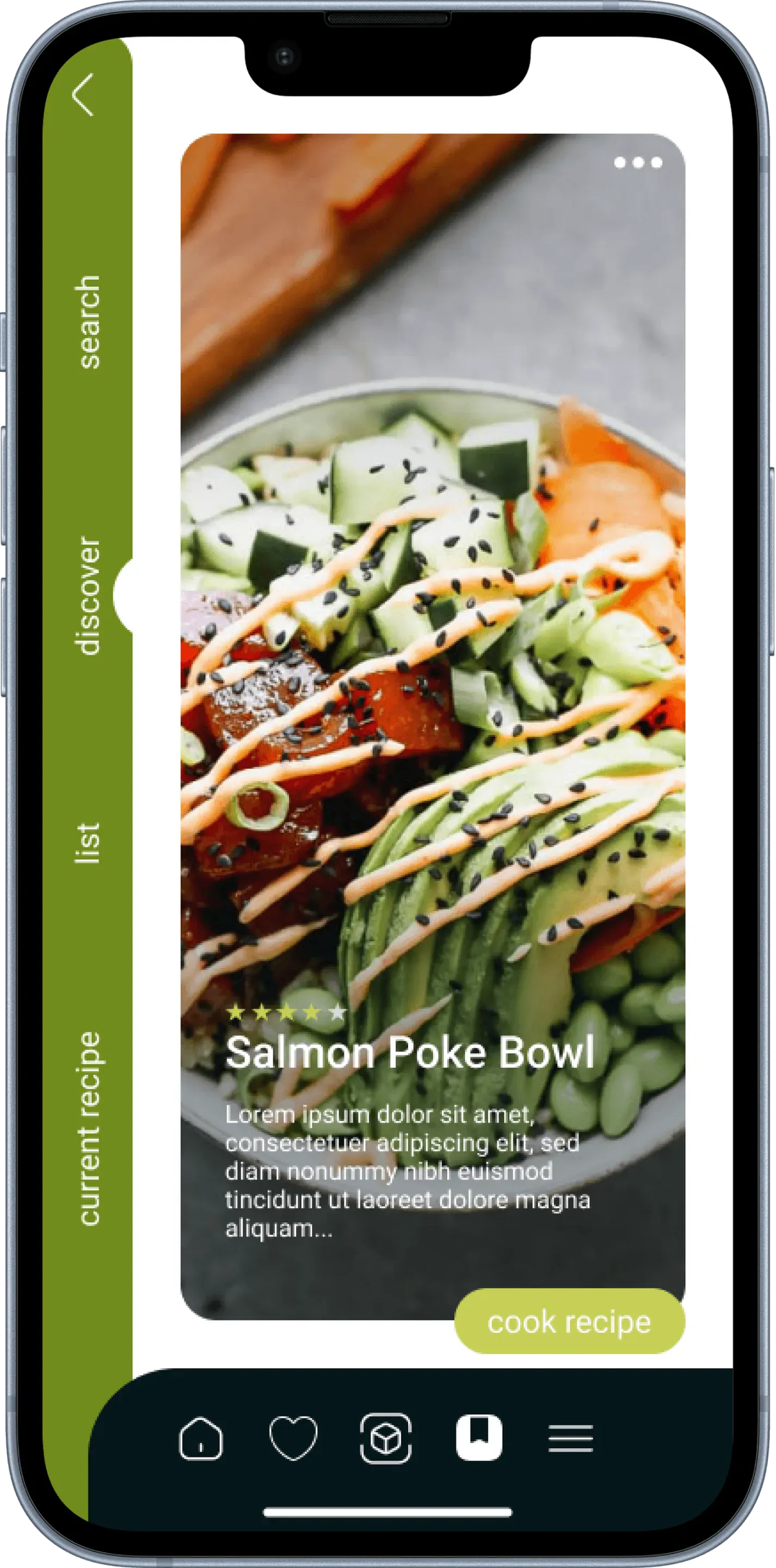
In the Discover menu, users can browse through various recipe options based on selected ingredients. When ready to either cook or preview a recipe, a simple upward scroll is all it takes.
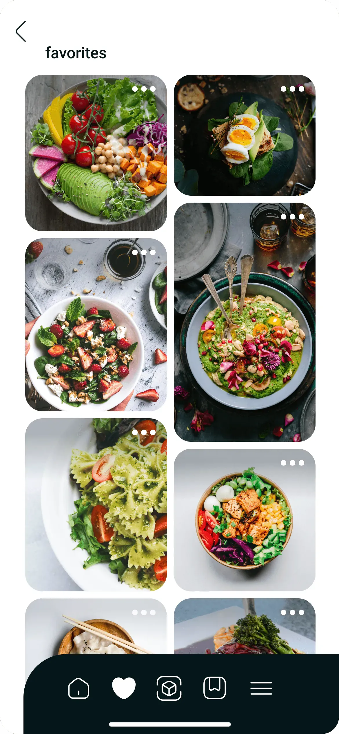
The menu features a heart icon, serving as the user's Favorites page for quick access to preferred recipes.
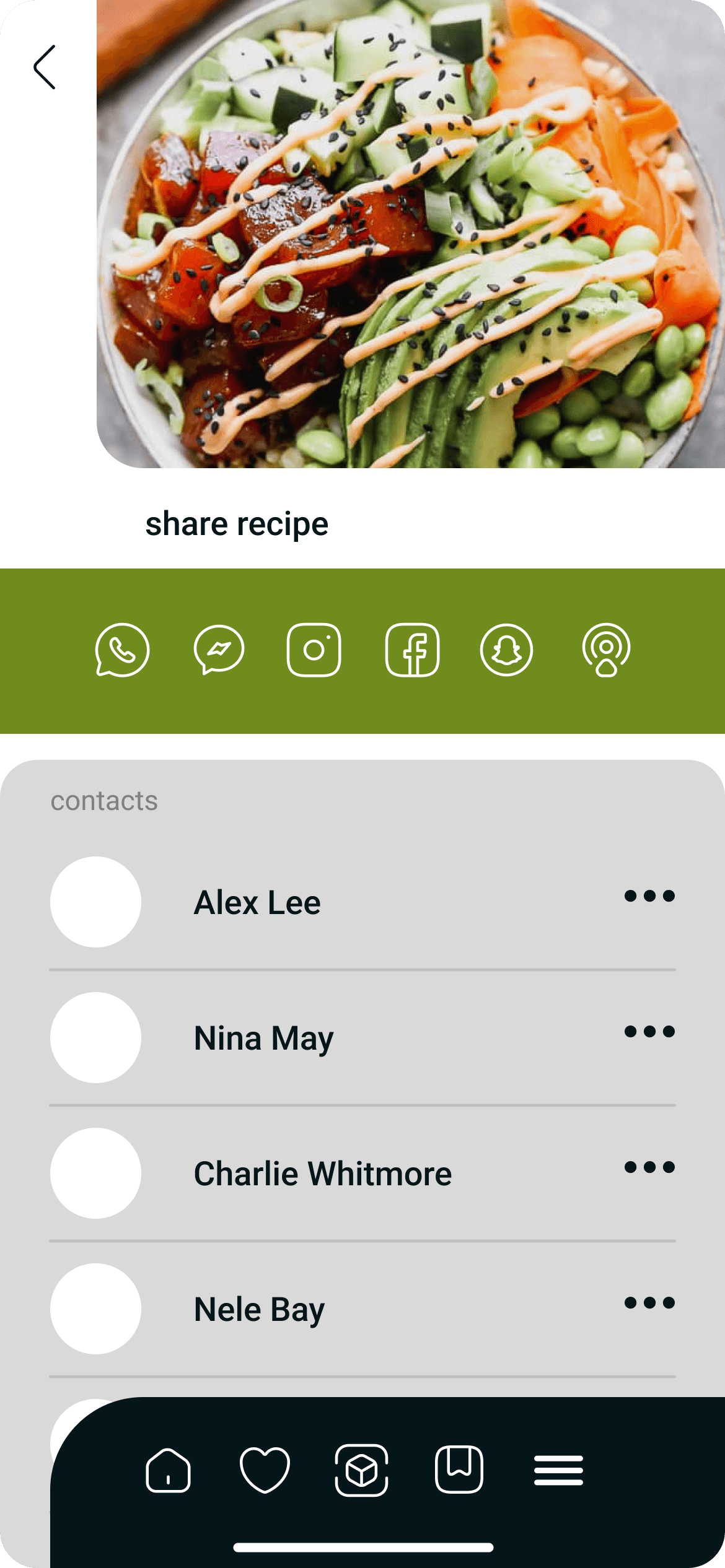
Users can easily share and showcase their favorite or self-created recipes with a simple sharing feature.
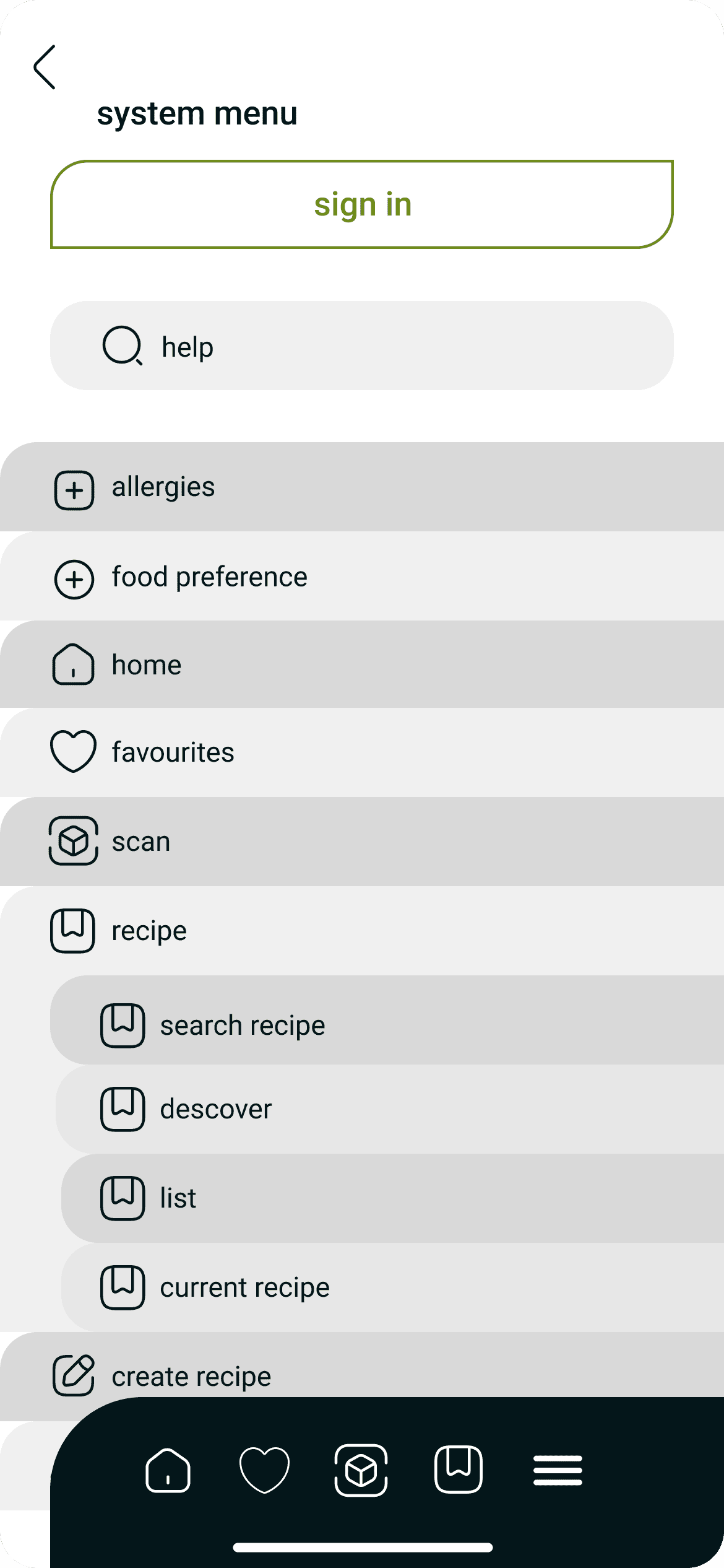
The system menu streamlines user navigation, offering a curated list of pages for quick access to specific content.